Dev UI
全般的な概要
Quarkus Dev UI は、アプリケーションを開発モード (./mvnw quarkus:dev) で実行したときに起動する、開発者に優しいユーザーインターフェースです。これは、コードを変更したり再起動したりすることなく、アプリケーションの実行中に、アプリケーションの探索、デバッグ、対話を行うための強力なポータルとして機能します。
Dev UI とは?
Dev UI は、Quarkus の内部動作を観測可能で拡張可能にすることで、開発者の喜びを高めるように設計されています。それは以下を提供します:
-
利用可能なエクステンションとその機能に関するインサイト
-
ランタイムメタデータとツールへのアクセス
-
ホットリロードと密接に統合されたレスポンシブなフロントエンド
-
エクステンションが設定、ドキュメント、アクションを公開するための柔軟な方法
プロジェクトを探索する開発者であろうと、エクスペリエンスを強化するエクステンション作成者であろうと、Dev UI はあなたの入り口となります。
レイアウトの概要
開発モードで実行している場合、Quarkus は http://localhost:8080/q/dev-ui でアクセスできる動的でモジュラーな Web インターフェースを提供します。コンソールログで d をクリックすると、デフォルトのブラウザーで Dev UI が開きます。
基本的なレイアウトは以下の部分で構成されています:
-
メニュー
-
ページ
-
フッター
-
カード
-
設定
以下はレイアウトの視覚的な概要です:
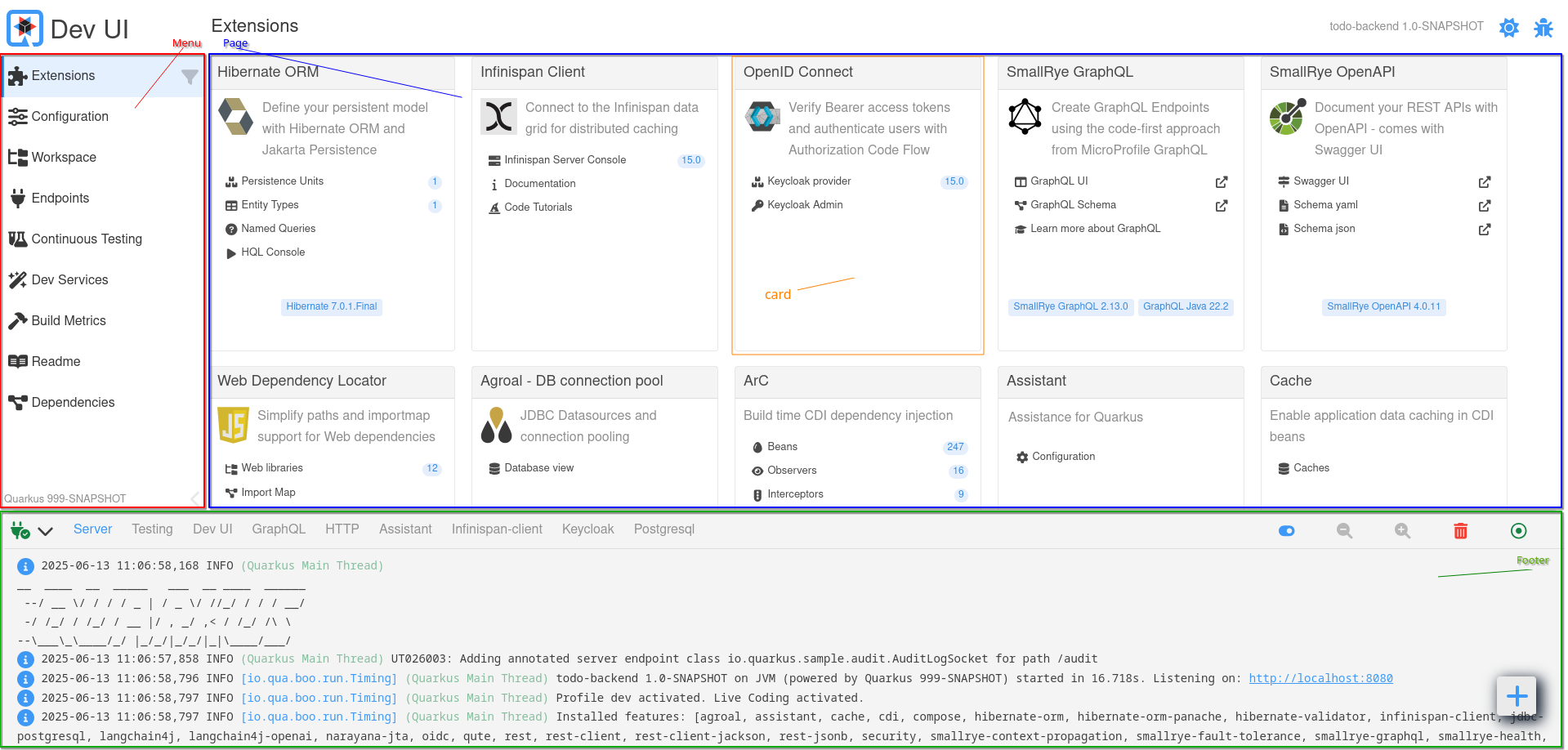
メニュー (左サイドバー)
左側の メニュー は、組み込みページへの構造化されたアクセスを提供します。
| メニュー項目 | 説明 |
|---|---|
エクステンション |
すべての Quarkus エクステンション (現在のアプリケーションで使用されているもの) をカードとして表示します。各カードは、設定、ドキュメント、またはツールを提供する場合があります。 |
設定 |
すべての設定オプション (現在、デフォルト、およびドキュメント情報を含む) を表示します。設定エディター (テキストおよびフォームモード) も含まれます。 |
ワークスペース |
プロジェクトファイルブラウザー。ファイルはインラインで開いたり編集したりできます。エクステンションはワークスペースアクションを追加できます。 |
Endpoints |
すべての HTTP エンドポイント (REST、GraphQL、内部など) を一覧表示します。アプリケーション内の利用可能なルートを検査するのに役立ちます。 |
継続的テスト |
継続的テストを監視および制御します。テスト結果の表示、テストの再実行、テスト状態の切り替えが可能です。 |
Dev Services |
自動的に開始されたサービス (例: データベース、Kafka ブローカー) に関する情報を表示します。 |
ビルドメトリクス |
最後のビルドおよびリロードサイクルからのパフォーマンスメトリクスを提供します。 |
Readme |
利用可能な場合、プロジェクトの |
依存関係 |
すべてのランタイムおよびデプロイメントの依存関係を、依存関係パスの探索および検索機能とともに表示します。 |
| エクステンションカードからメニューにページをドラッグして、すばやくアクセスできるように ブックマーク できます。 |
ページ領域 (メインコンテンツ)
メインパネル は、選択されたメニュー項目またはエクステンションのコンテンツを表示します。選択されたページに応じて、以下をレンダリングする場合があります:
-
エクステンション固有のツールと UI (例: GraphQL UI、Swagger UI)
-
JSON ビューアー、コードエディター、またはメトリクスチャート
-
インタラクティブなアクション (例: ボタン、トグル)
-
ドキュメントとリンク
ページはモジュラーで動的にロードされます。エクステンションは、Web Components を使用して記述されたカスタムページを提供し、JSON-RPC を介してバックエンドと対話できます。
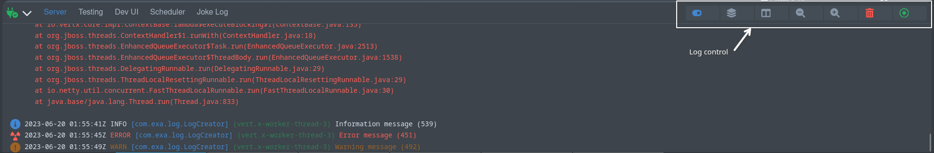
フッター
下部の フッター は、主にアプリケーションが開発モードで実行されている間のログを表示するために使用されます。
デフォルトでは、 Server ログ (標準の Quarkus ログ出力) が選択されますが、どのエクステンションが存在するかによって、追加のログタブが表示される場合があります。例えば、
-
関連するエクステンションが使用されている場合、
HTTP、GraphQL、Schedulerなどが表示されることがあります。 -
データベース、Kafka ブローカーなどの起動されたサービスからの
Dev Servicesログ出力
このライブログビューは、開発者が動作を追跡し、問題をデバッグし、ターミナルに切り替えることなく Dev Services を監視するのに役立ちます。
カード
Dev UI に貢献する各 Quarkus エクステンションは、 エクステンション ページでカードとして表示されます。これらのカードは、エクステンションが提供する機能、ドキュメント、設定、およびランタイムツールへの素早いアクセスを提供します。
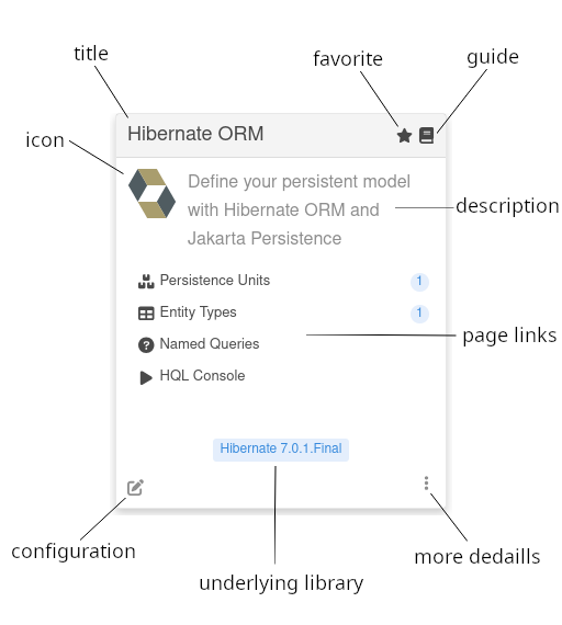
各カードには以下の要素が含まれる場合があります。
| 要素 | 説明 |
|---|---|
ロゴ (オプション) |
エクステンションまたはそのドメインを表すオプションのロゴ |
タイトル |
Dev UI で認識されるエクステンションの名前。 |
お気に入り |
カードをお気に入りとしてマークします。お気に入りに追加されたカードは、より簡単にアクセスできるよう、エクステンションビューで常に最初に表示されます。 |
ガイド (オプション) |
エクステンションのオンライン Quarkus ガイドへのリンク (利用可能な場合)。 |
説明 |
エクステンションが何をするのか、または何を有効にするのかについての短い説明。 |
ページリンク (オプション) |
エクステンションによって提供されるカスタムページに移動するインタラクティブなエントリ。ページリンクは、後で説明するラベルをオプションで含むこともできます。 |
設定 |
このエクステンションに関連する設定にフィルタリングされた設定エディターへのショートカット。 |
基盤となるライブラリ (オプション) |
エクステンションを駆動する主要ライブラリのバージョンを表示します (もしあれば)。 |
Text (optional) |
Displays informational text values (such as versions, counts, or status) as badge-style elements. Can show static, dynamic (fetched once), or streaming (continuously updated) values. |
詳細 |
すべての情報を含むダイアログを開きます |
| カード内のページリンクをクリックすると、その機能専用の UI ページに移動します。これらのページは、素早くアクセスできるようにメニューにブックマークできます。 |
エクステンションは、ランタイムで提供するものに基づいて、カードを自由にカスタマイズし、インタラクティブな動作を追加できます。
エクステンション開発者向けガイド
Quarkus エクステンションは、Dev UI に貢献することで開発エクスペリエンスを向上させることができます。このガイドの残りの部分では、メタデータ設定、カード、メニュー、フッターへのページの追加、動的コンテンツのベストプラクティスなど、エクステンションを Dev UI に統合する方法を概説します。
quarkus-extension.yaml
エクステンションが Dev UI に表示されるようにするには、エクステンションの runtime モジュールの src/main/resources/META-INF ディレクトリに quarkus-extension.yaml ファイルが存在することを確認してください。このファイルは、Dev UI がエクステンションカードを生成するために使用するメタデータを提供します。
例:
name: "Hibernate ORM"
description: "Define your persistent model with Hibernate ORM and Jakarta Persistence"
guide: "https://quarkus.io/guides/hibernate-orm"
metadata:
  categories:
    - "data"
  config:
    - "quarkus.hibernate-orm"
主要なフィールド:
-
name: Dev UI カードにエクステンションのタイトルとして表示されます。 -
description: カードの要約として表示されます。 -
guide: エクステンションのガイドへの URL。カード上のガイドアイコンのレンダリングに使用されます。 -
metadata.config: カードの「設定」をクリックしたときに表示される設定キーをフィルタリングします。
Dev UI へのページの追加
あなたのエクステンションのデプロイメントモジュールには、以下の依存関係が必要です。
<dependency>
    <groupId>io.quarkus</groupId>
    <artifactId>quarkus-devui-deployment-spi</artifactId>
</dependency>
これは推移的または直接的に含めることができ、デプロイメントモジュールでのみ必要です。これにより、プロセッサーは関連するビルドアイテムにアクセスできます。
エクステンションは、以下の領域で Dev UI にインタラクティブなページを貢献できます。
-
カード: エクステンションカードに直接ページへのリンクを追加します。
-
フッター: ログやその他のランタイム情報用のタブをフッターに追加します。
-
メニュー: Dev UI の左側メニューにページを追加します。
-
設定: 設定ダイアログにタブを追加します。
-
未掲載: 上記のどこにもリストされていませんが、ルーターに追加され、リンクできるページ。
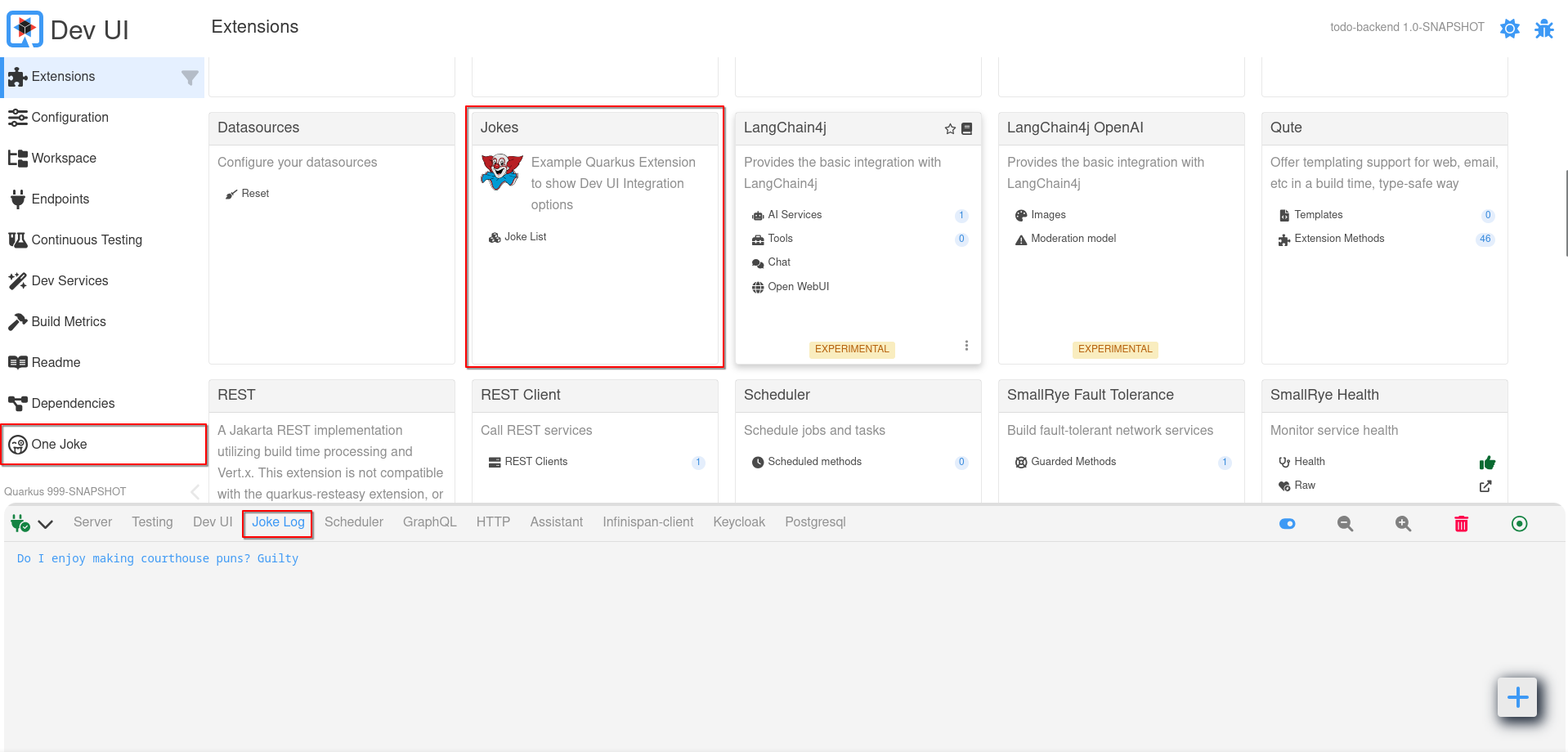
カード
Dev UI に貢献する最も一般的な方法は、エクステンションページにあるエクステンションカードのページを経由することです。
エクステンションのカードにリンクを追加するには、@BuildStep で CardPageBuildItem を生成します。
    @BuildStep(onlyIf = IsLocalDevelopment.class) (1)
    void createJokesPageOnCard(BuildProducer<CardPageBuildItem> cardsProducer) {

        CardPageBuildItem cardPageBuildItem = new CardPageBuildItem(); (2)
        cardPageBuildItem.setLogo("clown.svg", "clown.svg"); (3)

        cardPageBuildItem.addPage(Page.webComponentPageBuilder() (4)
                .title("Joke List") (5)
                .icon("font-awesome-solid:cubes") (6)
                .componentLink("qwc-jokes-list.js")); (7)

        cardsProducer.produce(cardPageBuildItem);
}| 1 | このビルドステップは、必ずローカル開発モードでのみ実行されるようにしてください。 |
| 2 | カードに何かを追加するには、CardPageBuildItem を返す/生成する必要があります。 |
| 3 | deployment/src/main/resources/dev-ui/ にロゴ (ダークモードとライトモード) を任意で追加できます。 |
| 4 | カードにリンクを追加するには、すべてのリンクが「ページ」に移動するため、addPage メソッドを使用できます。Page には、ページの構築を支援するいくつかのビルダーがあります。最も一般的なのは webComponentPageBuilder ですが、他のいくつかについては後で説明します。 |
| 5 | タイトルを (任意で) 追加できます。追加しない場合、タイトルはコンポーネントリンクから導出されます。 |
| 6 | アイコンを追加できます。すべての無料の font-awesome アイコンが利用可能です。 |
| 7 | deployment/src/main/resources/dev-ui/ にある Web コンポーネントのソース (js) ファイルへのリンクを追加します。これは qwc-extensionname-pagename.js の形式である必要があります。 |
この Web コンポーネントページを作成する方法については後で説明します。
|
アイコンに関する注意
Font awesome でアイコンを見つけた場合、次のようにマッピングできます: 例 <i class="fa-solid fa-house"></i> は font-awesome-solid:house にマッピングされるため、fa は font-awesome になり、アイコン名から fa- を削除します。
|
オプション: ライブラリーバージョン
カードに基盤となるライブラリーバッジを追加できます。これは、エクステンションがよく知られたライブラリーを公開している場合に便利です。例えば、quarkus-hibernate-orm エクステンションは Hibernate へのアクセスを提供します。基盤となる Hibernate の詳細を表示することは、ユーザーにとって有用な情報となる可能性があります。
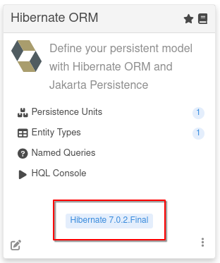
これは addLibraryVersion メソッドを使用して実行できます。
cardPageBuildItem.addLibraryVersion("org.hibernate.orm", "hibernate-core", "Hibernate", "https://hibernate.org/orm/");groupId と artifactId (バージョンを検索できるように) および名前と、任意で URL を提供します。
オプション: ビルド時データ
ビルド中に収集されたデータを Page (js) に渡すことができます。
cardPageBuildItem.addBuildTimeData("jokes", jokesBuildItem.getJokes());ページに必要なことがビルド時にわかっているすべてのデータに対して、これらのキーと値のペアを複数追加できます。
キーは自動的にスコープ設定されるため、名前空間をプレフィックスとして付ける必要はありません。このデータを Web コンポーネント (ページ) でアクセスする方法については後で説明します。
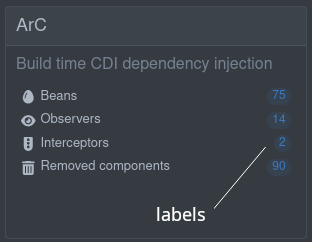
オプション: ラベル
ページビルダーのいずれかのビルダーメソッドを使用して、カード内のリンクにオプションのラベルを追加できます。これらのラベルは次のとおりです。
-
静的 (ビルド時に既知)
.staticLabel("staticLabelValue") -
動的 (実行時にロード)
.dynamicLabelJsonRPCMethodName("yourJsonRPCMethodName") -
ストリーミング (実行時に更新された値を継続的にストリーミング)
.streamingLabelJsonRPCMethodName("yourJsonRPCMethodName")
動的ラベルとストリーミングラベルの場合、メソッド名は JsonRPC メソッドの名前であり、これについては後で説明します。
Optional: Card Actions
You can add action buttons to your extension’s card. Unlike page links (which navigate to a page), actions trigger behavior when clicked — they call a JsonRPC method or hit a URL and optionally show the result as a toast notification.
To add an action, use the addAction method on CardPageBuildItem:
cardPageBuildItem.addAction(CardAction.actionBuilder() (1)
        .title("Clean All") (2)
        .icon("font-awesome-solid:broom") (3)
        .tooltip("Clean all databases") (4)
        .jsonRpcMethodName("cleanAll") (5)
.build());| 1 | Create an action using the CardAction.actionBuilder() factory. |
| 2 | The button label (required). |
| 3 | A Font Awesome icon displayed next to the label (optional). |
| 4 | A tooltip shown on hover (optional). |
| 5 | The JsonRPC method to call when the button is clicked. This uses the same JsonRPC service as page labels — we will discuss how to create JsonRPC services later. |
By default, the result of the JsonRPC call is shown as a toast notification. To disable this:
cardPageBuildItem.addAction(CardAction.actionBuilder()
        .title("Refresh")
        .icon("font-awesome-solid:arrows-rotate")
        .jsonRpcMethodName("refresh")
        .showResultNotification(false) (1)
.build());| 1 | Set to false to suppress the result notification. |
You can also create URL actions that send a GET request to a URL:
cardPageBuildItem.addAction(CardAction.actionBuilder()
        .title("Ping")
        .url("/q/health") (1)
.build());| 1 | Use url() instead of jsonRpcMethodName() to hit a URL endpoint. |
You can combine page links and action buttons on the same card:
CardPageBuildItem cardPageBuildItem = new CardPageBuildItem();

cardPageBuildItem.addPage(Page.webComponentPageBuilder()
        .title("Datasources")
        .icon("font-awesome-solid:database")
        .componentLink("qwc-flyway-datasources.js"));

cardPageBuildItem.addAction(CardAction.actionBuilder()
        .title("Clean All")
        .icon("font-awesome-solid:broom")
        .jsonRpcMethodName("cleanAll")
        .build());
Optional: Card Texts
You can display text values directly on your extension’s card. Unlike page links (which navigate to a page) or actions (which trigger behavior), card texts show informational data — such as versions, counts, or status indicators — as badge-style elements on the card itself.
Card texts support three modes:
-
Static — a fixed value known at build time.
-
Dynamic — a value fetched once at runtime via a JsonRPC method call.
-
Streaming — a value continuously updated at runtime via a streaming JsonRPC method.
To add a text, use the addText method on CardPageBuildItem:
cardPageBuildItem.addText(CardText.textBuilder() (1)
        .title("Version") (2)
        .icon("font-awesome-solid:tag") (3)
        .staticText("2.1.0") (4)
.build());| 1 | Create a card text using the CardText.textBuilder() factory. |
| 2 | An optional label displayed next to the value. |
| 3 | A Font Awesome icon displayed next to the label (optional). |
| 4 | A static text value known at build time. |
For runtime values fetched once, use dynamicText with a JsonRPC method name:
cardPageBuildItem.addText(CardText.textBuilder()
        .title("Status")
        .icon("font-awesome-solid:circle-info")
        .dynamicText("getStatus") (1)
.build());| 1 | The JsonRPC method to call once to fetch the current value. |
For continuously updated values, use streamingText:
cardPageBuildItem.addText(CardText.textBuilder()
        .title("Connections")
        .icon("font-awesome-solid:link")
        .streamingText("streamConnectionCount") (1)
        .streamingTextParams("param1", "param2") (2)
.build());| 1 | The streaming JsonRPC method that pushes updated values. |
| 2 | Optional parameters to pass to the streaming method. These are resolved from the extension’s local storage. |
You can add multiple card texts, and combine them with page links and actions on the same card.
フッター
カードとページを追加する以外に、エクステンションはフッターにタブを追加できます。これは、継続的に発生する事柄に便利です。ページ (または Web コンポーネント) から移動すると、ページは DOM (および場合によってはバックエンド) から切断されますが、フッターのログは常にビュー (またはアプリ) の一部であるため、DOM に永続的に接続されます。
フッターに要素を追加する方法は2つあります。最も簡単な方法は、BuildItem でログを公開することです。ここでは、 Flow.Publisher<String> を返すサプライヤー (関数) か、 RuntimeValue<SubmissionPublisher<String>> のいずれかを想定しています。
@BuildStep(onlyIf = { IsLocalDevelopment.class }) (1)
public void createFooterLog(BuildProducer<FooterLogBuildItem> footerLogProducer){
    footerLogProducer.produce(new FooterLogBuildItem("My Extension Log", () -> {(2)
        return createLogPublisher();(3)
    }));
}| 1 | このビルドステップは、必ずローカル開発モードでのみ実行されるようにしてください。 |
| 2 | FooterLogBuildItem を返す/生成する必要があります。 |
| 3 | ここでは、ログをストリーミングする Flow.Publisher<String> を返します。 |
RuntimeValue は、ログが実行時にのみ利用可能な場合に便利です。デプロイメントモジュールでログを取得できる場合は、サプライヤーを使用できます。
または、UI を完全に制御し、FooterPageBuildItem を生成し、js ファイルでカスタム Web コンポーネントを提供することもできます。
    @BuildStep(onlyIf = IsLocalDevelopment.class)(1)
    void createJokesLog(BuildProducer<FooterPageBuildItem> footerProducer) {

            FooterPageBuildItem footerPageBuildItem = new FooterPageBuildItem();(2)

            footerPageBuildItem.addPage(Page.webComponentPageBuilder()(3)
                    .title("Joke Log")(4)
                    .icon("font-awesome-regular:face-grin-tongue-wink")(5)
                    .componentLink("qwc-jokes-log.js"));(6)

            footerProducer.produce(footerPageBuildItem);
}| 1 | このビルドステップは、必ずローカル開発モードでのみ実行されるようにしてください。 |
| 2 | フッターに何かを追加するには、FooterPageBuildItem を返す/生成する必要があります。 |
| 3 | フッターにタブを追加するには、すべてのタブが「ページ」をレンダリングするため、addPage メソッドを使用できます。Page には、ページの構築を支援するいくつかのビルダーがあります。最も一般的なのは webComponentPageBuilder ですが、他のいくつかについては後で説明します。 |
| 4 | タイトルを (任意で) 追加できます。追加しない場合、タイトルはコンポーネントリンクから導出されます。 |
| 5 | アイコンを追加できます。すべての無料の font-awesome アイコンが利用可能です。 |
| 6 | deployment/src/main/resources/dev-ui/ にある Web コンポーネントのソース (js) ファイルへのリンクを追加します。これは qwc-extensionname-pagename.js の形式である必要があります。 |
メニュー
Dev UI メニューにページを追加するには、MenuPageBuildItem を生成します。
    @BuildStep(onlyIf = IsLocalDevelopment.class) (1)
    void createJokesMenu(BuildProducer<MenuPageBuildItem> menuProducer) {

        MenuPageBuildItem menuPageBuildItem = new MenuPageBuildItem();  (2)

        menuPageBuildItem.addPage(Page.webComponentPageBuilder() (3)
                .title("One Joke") (4)
                .icon("font-awesome-regular:face-grin-tongue-wink") (5)
                .componentLink("qwc-jokes-menu.js")); (6)

        menuProducer.produce(menuPageBuildItem);
    }
}| 1 | このビルドステップは、必ずローカル開発モードでのみ実行されるようにしてください。 |
| 2 | メニューに何かを追加するには、MenuPageBuildItem を返す/生成する必要があります。 |
| 3 | メニューにリンクを追加するには、すべてのリンクが「ページ」に移動するため、addPage メソッドを使用できます。Page には、ページの構築を支援するいくつかのビルダーがあります。最も一般的なのは webComponentPageBuilder ですが、他のいくつかについては後で説明します。 |
| 4 | タイトルを (任意で) 追加できます。追加しない場合、タイトルはコンポーネントリンクから導出されます。 |
| 5 | アイコンを追加できます。すべての無料の font-awesome アイコンが利用可能です。 |
| 6 | deployment/src/main/resources/dev-ui/ にある Web コンポーネントのソース (js) ファイルへのリンクを追加します。これは qwc-extensionname-pagename.js の形式である必要があります。 |
このページは、「Configuration」や「Workspace」のような組み込みメニュー項目の横に表示されます。
設定
Dev UI 設定ダイアログにタブを追加するには、SettingPageBuildItem を生成します。
    @BuildStep(onlyIf = IsLocalDevelopment.class) (1)
    void createMCPSettingsTab(BuildProducer<SettingPageBuildItem> settingPageProducer) {

        SettingPageBuildItem mcpSettingTab = new SettingPageBuildItem();(2)

        mcpSettingTab.addPage(Page.webComponentPageBuilder() (3)
                .title("Dev MCP")(4)
                .icon("font-awesome-solid:robot") (5)
                .componentLink("qwc-dev-mcp-setting.js")); (6)
        settingPageProducer.produce(mcpSettingTab);
    }
}| 1 | このビルドステップは、必ずローカル開発モードでのみ実行されるようにしてください。 |
| 2 | 設定タブに何かを追加するには、SettingPageBuildItem を返す/生成する必要があります。 |
| 3 | 設定ダイアログにタブを追加するには、addPage メソッドを使用できます。 |
| 4 | タイトルを (任意で) 追加できます。追加しない場合、タイトルはコンポーネントリンクから導出されます。 |
| 5 | アイコンを追加できます。すべての無料の font-awesome アイコンが利用可能です。 |
| 6 | deployment/src/main/resources/dev-ui/ にある Web コンポーネントのソース (js) ファイルへのリンクを追加します。これは qwc-extensionname-pagename.js の形式である必要があります。 |
このページは、設定ダイアログのそのタブのコンテンツとしてロードされます。
未掲載ページ
最後に、どこにもリストされていませんが、ルーターに追加され、ナビゲートできるページを追加できます。これは、より多くのページにナビゲートする非常に複雑なページを構築している場合に便利です。
これを行うには、UnlistedPageBuildItem を生成します。
    @BuildStep(onlyIf = IsLocalDevelopment.class) (1)
    void createMCPUnlistedPages(BuildProducer<UnlistedPageBuildItem> unlistedPageProducer) {

        UnlistedPageBuildItem mcpOtherPages = new UnlistedPageBuildItem(); (2)

        mcpOtherPages.addPage(Page.webComponentPageBuilder() (3)
                .title("Tools") (4)
                .icon("font-awesome-solid:screwdriver-wrench") (5)
                .componentLink("qwc-dev-mcp-tools.js"));  (6)
        unlistedPageProducer.produce(mcpOtherPages);
    }
}| 1 | このビルドステップは、必ずローカル開発モードでのみ実行されるようにしてください。 |
| 2 | 未掲載ページを追加するには、UnlistedPageBuildItem を返す/生成する必要があります。 |
| 3 | addPage メソッドを使用します。 |
| 4 | タイトルを (任意で) 追加できます。追加しない場合、タイトルはコンポーネントリンクから導出されます。 |
| 5 | アイコンを追加できます。すべての無料の font-awesome アイコンが利用可能です。 |
| 6 | deployment/src/main/resources/dev-ui/ にある Web コンポーネントのソース (js) ファイルへのリンクを追加します。これは qwc-extensionname-pagename.js の形式である必要があります。 |
このページはルーターに登録され、通常のリンクまたはルーターを使用して移動できます。
import { RouterController } from 'router-controller'; (1)

// ...

routerController = new RouterController(this); (2)

// ...

let unlistedPages = this.routerController.getPagesForCurrentNamespace(); (3)
// or if you not in your own space
// let unlistedPages = this.routerController.getPagesForNamespace("your namespace"); (4)

// ... loop over page
this.routerController.go(page); (5)| 1 | RouterController をインポートします |
| 2 | 新しいインスタンスを作成し、this を渡して名前空間にスコープを設定します |
| 3 | 名前空間のすべてのページを取得します |
| 4 | または、別のページ (自分のページではない) にいる場合は、自分の名前空間のページを取得できます |
| 5 | その後、ページをループしてリンク/ボタンを構築できます。ナビゲーションを実行するには go メソッドを使用します |
Web コンポーネントの構築
Dev UI は Lit を使用して、これらの Web コンポーネントの構築を容易にします。Web コンポーネントと Lit の詳細は、以下を参照してください。
Dev UI の JavaScript コードのほとんどは Lit を使用して記述されているため、Lit ドキュメントで利用可能な操作を探してください。たとえば、各サイクルは次のようになります。
render() {
  return html`
    <ul>
      ${this.colors.map((color) =>
        html`<li style="color: ${color}">${color}</li>`
      )}
    </ul>
  `;
}
Web コンポーネントページの基本構造
Web コンポーネントページは、新しい HTML 要素を作成する JavaScript クラスにすぎません。
import { LitElement, html, css} from 'lit'; (1)
import { jokes } from 'build-time-data'; (2)

export class QwcJokesList extends LitElement { (3)

    static styles = css` (4)
        .buttonBar {
            display: flex;
            justify-content: space-between;
            gap: 10px;
            align-items: center;
            width: 90%;
            color: var(--lumo-primary-text-color); (5)
        }

        .buttonBar .button {
            width: 100%;
        }
        `;

    static properties = {
        _jokes: {state: true},
        _numberOfJokes: {state: true},
        _message: {state: true},
        _isStreaming: {state: true} (6)
    };

    constructor() { (7)
        super();
        this._jokes = [];
        this._numberOfJokes = 0;
        this._isStreaming = false;
    }

    connectedCallback() { (8)
        super.connectedCallback();
        jokes.forEach((joke) =>{
            var item = this._toJokeItem(joke);
            this._jokes.push(item);
        });
        this._numberOfJokes = this._jokes.length;
    }

    disconnectedCallback() { (9)
        if(this._isStreaming){
            this._observer.cancel();
        }
        super.disconnectedCallback()
    }

    render() { (10)
         return html`<h3>Here are ${this._numberOfJokes} jokes</h3> (11)
            <vaadin-message-list .items="${this._jokes}"></vaadin-message-list>

            ${this._renderLoadingMessage()}
            <div class="buttonBar">
                <vaadin-button class="button" theme="success" @click=${() => this._fetchMoreJokes()}>
                    <vaadin-icon icon="font-awesome-solid:comment"></vaadin-icon> Tell me more jokes
                </vaadin-button>
                <vaadin-checkbox class="button" label="Stream new jokes continuously" @input=${(e) =>this._startStopStreaming(e)}></vaadin-checkbox>
            </div>
            `;
    }

    // ... more private methods
}
customElements.define('qwc-jokes-list', QwcJokesList); (12)| 1 | 他のライブラリーからクラスや関数をインポートできます。この場合、Lit の LitElement クラスと html および css 関数を使用します。 |
| 2 | ビルドステップで定義されたビルド時データは、キーを使用して build-time-data から常にインポートできます。ビルドステップで追加されたすべてのキーが利用可能になります。 |
| 3 | コンポーネントの名前は、Qwc (Quarkus Web コンポーネントの略)、次にエクステンション名、次にページタイトルをすべて Camel Case で連結した形式で命名する必要があります。これは、先に説明したファイル名の形式とも一致します。コンポーネントは LitComponent を拡張する必要もあります。 |
| 4 | CSS スタイルは css 関数を使用して追加でき、これらのスタイルはコンポーネントにのみ適用されます。 |
| 5 | スタイルは、グローバルに定義された CSS 変数を参照して、特にライトモードとダークモードの切り替え時にページが正しくレンダリングされることを保証できます。すべての CSS 変数は、Vaadin ドキュメント ( カラー、 サイズと間隔 など) で確認できます。 |
| 6 | プロパティーを追加できます。そのプロパティーがプライベートである場合は、プロパティーの前に _ を使用します。プロパティーは通常 HTML テンプレートに注入され、状態を持つものとして定義できます。つまり、そのプロパティーが変更された場合、コンポーネント (またはその一部) は再レンダリングされるべきです。この場合、ジョークはビルド時に収集したビルド時データです。 |
| 7 | コンストラクター (オプション) は必ず最初に super を呼び出し、次にそのプロパティーのデフォルト値を設定する必要があります。 |
| 8 | connectedCallback は Lit のメソッドで、このコンポーネントが DOM に接続されたときに呼び出されます。ここは、バックエンドからデータを取得するなど、「ページロード」のような処理を行うのに適した場所です (これについては後で説明します)。 |
| 9 | disconnectedCallback は Lit のメソッドで、このコンポーネントが DOM から切断されたときに呼び出されます。ここは、クリーンアップを行うのに適した場所です。 |
| 10 | render は Lit のメソッドで、ページをレンダリングするために呼び出されます。このメソッドでは、必要なページのマークアップを返します。 |
| 11 | Lit の html 関数を使用できます。これにより、必要な HTML を出力するためのテンプレート言語が提供されます。テンプレートが作成されたら、プロパティーを設定または変更するだけでページコンテンツを再レンダリングできます。 Lit html の詳細はこちらを参照してください。 |
| 12 | Web コンポーネントは、必ず一意のタグを持つカスタム要素として登録する必要があります。この場合、タグはファイル名と同じ形式 (qwc ダッシュ エクステンション名 ダッシュ ページタイトル) に従います。 |
ホットリロード
ホットリロードの発生時に、画面を自動的に更新できます。これを行うには、Web コンポーネントが拡張する LitElement を QwcHotReloadElement に置き換えます。
QwcHotReloadElement は LitElement を拡張するため、コンポーネントは変わらず Lit 要素です。
QwcHotReloadElement を拡張する場合、hotReload メソッドを使用する必要があります。(Lit の render メソッドも引き続き提供する必要があります)
import { QwcHotReloadElement, html, css} from 'qwc-hot-reload-element';

// ...

export class QwcMyExtensionPage extends QwcHotReloadElement {

    render(){
        // ...
    }

    hotReload(){
        // ..
    }

}
ページに i18n を追加
Quarkus Dev UI は完全な国際化 (i18n) をサポートしています。これをエクステンションで有効にするには、すべてのユーザーに表示されるテキストを翻訳ファイルに外部化する必要があります。
すべての翻訳ファイルは以下に配置する必要があります。
<extension>/deployment/src/main/resources/dev-ui/i18n/
翻訳ファイルのレイアウト
各翻訳ファイルは、次のいずれかの命名パターンに従うプレーンな JavaScript モジュールです。
-
languagecode.js -
languagecode-COUNTRYCODE.js
ベースの 言語 ファイルには、すべての Dialect に共通の翻訳が含まれます。国固有 のファイルには、ベースと異なるキーのみが含まれます。
例えば、英語の場合:
-
en.js— ベース英語 -
en-US.js— アメリカ英語 (オーバーライドのみ) -
en-GB.js— イギリス英語 (オーバーライドのみ)
フランス語も同じパターンに従います。
-
fr.js— ベースフランス語 -
fr-FR.js— フランス固有 -
fr-CA.js— カナダ固有
ロケールコードのリストは、こちらで確認できます: https://simplelocalize.io/data/locales/
Quarkus Dev UI はデフォルトで英語です。ユーザーのブラウザのロケールがサポートされている場合、そのロケールがアクティブなデフォルトになります。ユーザーは、Dev UI の設定ダイアログから手動でロケールを変更することもできます。
翻訳ファイルの形式
各翻訳ファイルは、キーと値のペアを含む templates という定数をエクスポートする必要があります。
export const templates = {
    'myextension-some-key': 'Some translated value'
};
すべてのキーは次の命名規則に従う必要があります。
<extensionArtifactId>-<id>
ここで、<extensionArtifactId> は、エクステンションのランタイムモジュールの <artifactId> から取得されます。
例 (Agroal):
<artifactId>quarkus-agroal</artifactId>したがって、すべての翻訳キーは次の文字列で始まる必要があります。
quarkus-agroal-
必須キー
-
メタデータ
エクステンションの説明 (ランタイム POM の <description> 要素から取得) を翻訳するには、以下を定義します。
<extensionArtifactId>-meta-description
例:
'quarkus-agroal-meta-description': 'JDBC Datasources and connection pooling'-
ページタイトル
各 Dev UI ページ (CardPageBuildItem で作成) には、そのタイトルに対応する翻訳キーが必要です。
Agroal の「Database view」というタイトルのページの場合:
cardPageBuildItem.addPage(Page.webComponentPageBuilder()
        .icon("font-awesome-solid:database")
        .title("Database view")
        .componentLink("qwc-agroal-datasource.js"));
翻訳キーは quarkus-agroal-database_view になります。
(タイトルについては、スペースはアンダースコアに置換され、小文字になります。)
エントリ例:
'quarkus-agroal-database_view': 'Database view'-
一般テキスト
JS コード内の他のすべてのユーザーに表示される文字列も外部化する必要があります。
例:
import { str } from '@lit/localize';

export const templates = {
    // Metadata
    'quarkus-agroal-meta-description': 'JDBC Datasources and connection pooling',

    // Pages
    'quarkus-agroal-database_view': 'Database view',

    // General
    'quarkus-agroal-fetching-data-sources': 'Fetching data sources...'
};
JavaScript ページの更新
Lit コンポーネント内で翻訳を使用するには、次のようにコードを更新します。
-
ローカライゼーションヘルパーのインポート
import { msg, str, updateWhenLocaleChanges } from 'localization';-
msg: 翻訳キーを検索
-
str: 変数を含む動的文字列を作成
-
updateWhenLocaleChanges: 言語変更時に Lit に自動的に再レンダリングするように指示
-
ロケールの変更を登録
-
コンストラクターに以下を追加します。
constructor() {
    super();
    updateWhenLocaleChanges(this);
}-
インラインテキストを翻訳ルックアップに置き換える
変更前:
return this._renderProgressBar('Fetching data sources...');変更後:
return this._renderProgressBar(
    msg('Fetching data sources...', { id: 'quarkus-agroal-fetching-data-sources' })
);
キーが現在のロケールに存在しない場合、フォールバックテキスト ('Fetching data sources…') が自動的に使用されます。
例:
// en.js
'quarkus-agroal-fetching-data-sources': 'Fetching data sources...'

// fr.js
'quarkus-agroal-fetching-data-sources': 'Récupération des sources de données…'
1.1 翻訳内での変数の使用
動的メッセージの場合、デフォルトの文字列を str: で囲みます。
} catch (error) {
    notifier.showErrorMessage(
        msg(str`Failed to save file: ${error}`, { id: 'quarkus-agroal-file-save-failed' })
    );
}
翻訳ファイルでは、位置変数 (${0}, ${1}, …) を使用します。
// en.js
'quarkus-agroal-file-save-failed': str`Failed to save file: ${0}`,

// fr.js
'quarkus-agroal-file-save-failed': str`Échec de l’enregistrement du fichier : ${0}`,
UI コンポーネント
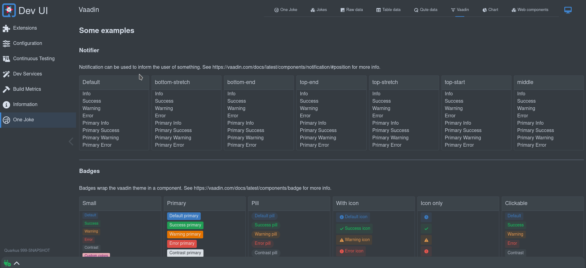
Vaadin Web コンポーネント
Vaadin Web コンポーネント: Dev UI は、UI ビルディングブロックとして Vaadin Web コンポーネントを広範に使用します。
Qomponent
Qomponent: 使用できるカスタムビルドコンポーネントがいくつかあります。
現在、以下の UI コンポーネントが利用可能です。
-
qui-dot - dot ファイルをレンダリングします。
-
qui-code-block - コードをレンダリングします。(下記「コードブロック」セクションを参照)
-
qui-directory-tree - ディレクトリツリーをレンダリングします (ワークスペース内など)。
-
qui-alert - アラートを表示します。
-
qui-card - カードコンポーネント。
-
qui-switch - スイッチボタン。
-
qui-badge - バッジコンポーネント。
コードブロック
コードブロック (マークアップされたコードを含む) を作成します。これは編集可能にすることもできます。このコンポーネントは、上記の qomponent のコードブロックを使用しており、それは code-mirror で構築されていますが、テーマを切り替える際に自動的なテーマ状態を追加します。
コードはリモート (src) またはプロパティー (content) として、あるいはスロット値 (下記の例) として提供できます。
import 'qui-themed-code-block';<qui-themed-code-block mode="properties">
<slot>
foo = bar
</slot>
</qui-themed-code-block>現在、以下のモードがサポートされています:
-
xml
-
javascript
-
php
-
cpp
-
go
-
rust
-
python
-
json
-
java
-
sql
-
yaml
-
html
-
css
-
sass
-
less
-
markdown
-
asciidoc
-
properties
-
asciiArmor
-
powerShell
-
shell
-
protobuf
-
dockerFile
-
diff
詳細については、 @qomponent/qui-code-block を参照してください。
内部コントローラーの使用
特定のことを容易にするために、いくつかの 内部コントローラー が利用可能です:
-
Notifier
-
Storage
-
Log
-
ルーター
Notifier
これはトーストメッセージを容易に表示する方法です。トーストは画面上 (デフォルトでは左下) に配置でき、レベル (Info、Success、Warning、Error) を持つことができます。いずれかのレベルをプライマリーにすることもでき、これによりより目立つトーストメッセージが作成されます。
このコントローラーのソースは、 こちら を参照してください。
使用例:
import { notifier } from 'notifier';<a @click=${() => this._info()}>Info</a>;_info(position = null){
notifier.showInfoMessage("This is an information message", position);
}有効なすべての位置は、 こちら で確認できます。
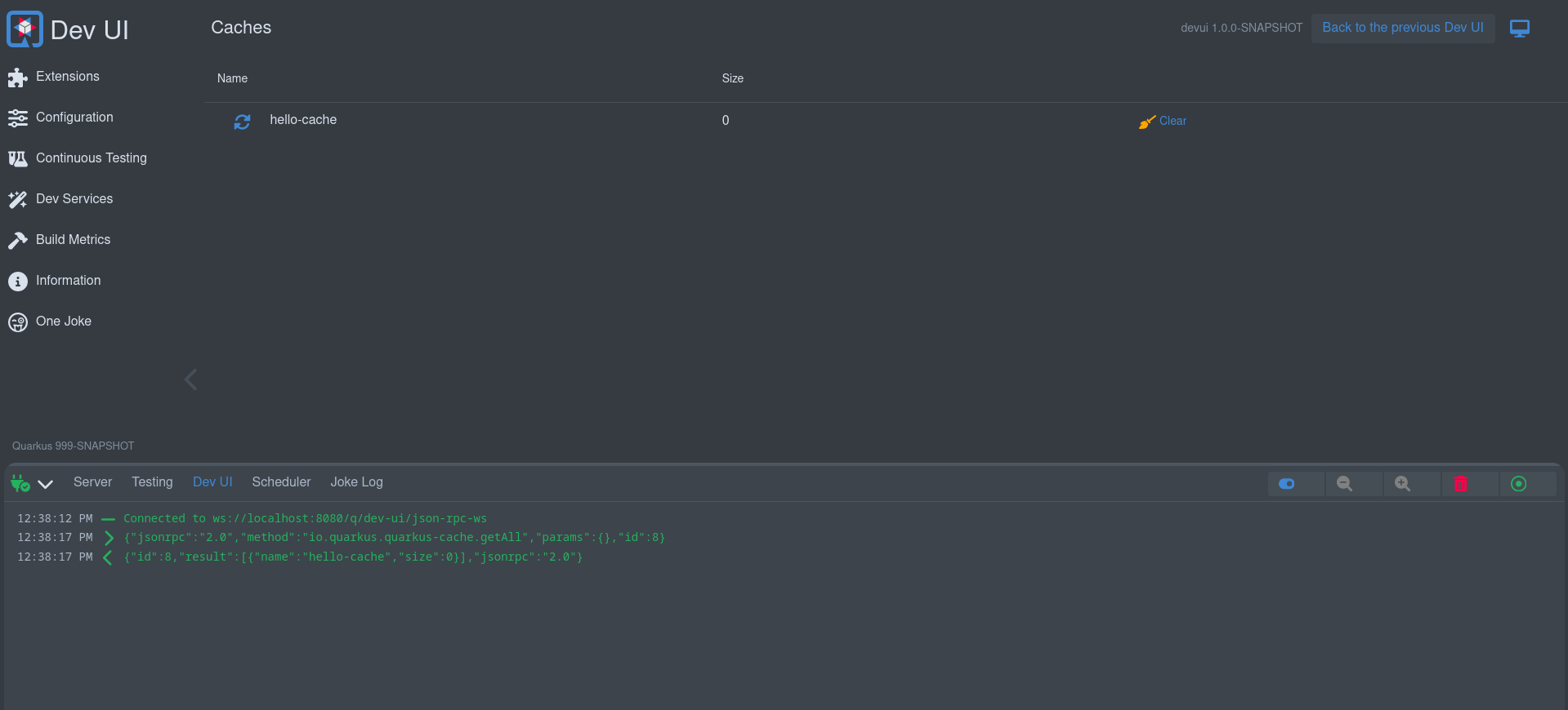
Storage
安全にローカルストレージにアクセスできる簡単な方法です。これにより、エクステンションのスコープに設定されたローカルストレージに値が保存されます。この方法では、別のエクステンションと競合する心配はありません。
ローカルストレージは、ユーザーの好みや状態を記憶するのに便利です。例えば、フッターは、一番下の引き出しの開閉状態と、開いたときのサイズを記憶します。
import { StorageController } from 'storage-controller';

// ...

storageControl = new StorageController(this); // Passing in this will scope the storage to your extension

// ...

const storedHeight = this.storageControl.get("height"); // Get some value

// ...

this.storageControl.set('height', 123); // Set some valアプリケーションごと
ストレージのスコープを現在のアプリケーションによってさらに絞り込むことができます:
storageControl = new StorageController(this, true); // Passing in true will scope per applicationストレージ設定
ユーザーは設定ページでストレージの生データを確認できます:
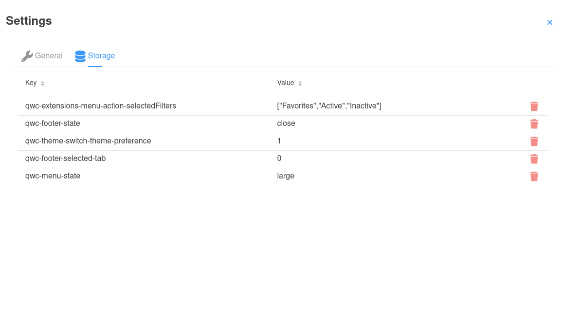
ユーザーは、この画面でストレージアイテムを削除することにより、クリーンアップ/デフォルトに戻すことができるため、エクステンションがこれに反応したい場合があります:
connectedCallback() {
        super.connectedCallback();
        window.addEventListener('storage-changed', this._storageChange); // Listen for storage changes
}

disconnectedCallback() {
        window.removeEventListener('storage-changed', this._storageChange); // Clean up
        super.disconnectedCallback();
}

_storageChange = (e) => {
    if(e.detail.method === "remove" && e.detail.key.startsWith("qwc-myextensionname-")){ // Only care about remove and your extension
        // React on storage removal
    }
}
Log
ログコントローラーは、(フッター) ログにコントロールボタンを追加するために使用されます。 フッター を参照してください。
import { LogController } from 'log-controller';

// ...

logControl = new LogController(this); // Passing in this will scope the control to your extension

// ...
this.logControl
                .addToggle("On/off switch", true, (e) => {
                    this._toggleOnOffClicked(e);
                }).addItem("Log levels", "font-awesome-solid:layer-group", "var(--lumo-tertiary-text-color)", (e) => {
                    this._logLevels();
                }).addItem("Columns", "font-awesome-solid:table-columns", "var(--lumo-tertiary-text-color)", (e) => {
                    this._columns();
                }).addItem("Zoom out", "font-awesome-solid:magnifying-glass-minus", "var(--lumo-tertiary-text-color)", (e) => {
                    this._zoomOut();
                }).addItem("Zoom in", "font-awesome-solid:magnifying-glass-plus", "var(--lumo-tertiary-text-color)", (e) => {
                    this._zoomIn();
                }).addItem("Clear", "font-awesome-solid:trash-can", "var(--lumo-error-color)", (e) => {
                    this._clearLog();
                }).addFollow("Follow log", true , (e) => {
                    this._toggleFollowLog(e);
}).done();ルーター
ルーターは主に内部的に使用されます。これは、SPA 内の正しいページ/セクションに URL をルーティングするために、舞台裏で Vaadin Router を使用します。これにより、ナビゲーションが更新され、履歴 (戻るボタン) が利用できるようになります。また、複数のページを持つエクステンションで利用可能なサブメニューも作成されます。
役立つ可能性のあるいくつかのメソッドについては、 コントローラー を参照してください。
グローバルな状態
Web コンポーネントページのプロパティーは、そのページ/Web コンポーネントのスコープです。コンポーネントで役立つ可能性のあるいくつかのグローバルな状態も利用できます。Dev UI はこの目的のために LitState を使用します。LitState は、使用している共有アプリケーション状態変数が変更されると、LitElement コンポーネントを自動的に再レンダリングします。これは LitElement のプロパティーに似ていますが、複数のコンポーネントで共有されます。
Dev UI は以下の組み込みの状態を備えています:
-
接続
-
テーマ
-
アシスタント
-
Dev UI
接続状態
これにより、バックエンドへの接続状態が得られます。Dev UI は Web Socket を使用してバックエンドに接続されています。UI は特定のケースでバックエンドへの接続を失う可能性があります。たとえば、ホットリロードが進行中である場合や、ユーザーが実際にサーバーを停止した場合などです。
ページでこの状態を使用するには:
import { observeState } from 'lit-element-state'; (1)
import { connectionState } from 'connection-state'; (2)

export class QwcExtensionPage extends observeState(LitElement) { (3)| 1 | LitState ライブラリーから observeState をインポートします。 |
| 2 | 関心のある状態 (この場合は接続状態) をインポートします。 |
| 3 | LitElement を observerState でラップします。 |
これで、ページのどこからでも接続状態にアクセスできるようになり、その状態が変化すると、ローカルの状態とまったく同じように動作し、ページの関連部分が再レンダリングされます:
render() {
    return html`<vaadin-icon title="${connectionState.current.message}" style="color:${connectionState.current.color}" icon="font-awesome-solid:${connectionState.current.icon}"></vaadin-icon>`;
    }
接続状態のすべてのプロパティーは こちら で確認できます。
テーマの状態
これにより、ユーザーがいつでも変更できる現在のテーマにアクセスできます。
ページでこの状態を使用するには:
import { observeState } from 'lit-element-state'; (1)
import { themeState } from 'theme-state'; (2)

export class QwcExtensionPage extends observeState(LitElement) { (3)| 1 | LitState ライブラリーから observeState をインポートします。 |
| 2 | 関心のある状態 (この場合はテーマ状態) をインポートします。 |
| 3 | LitElement を observerState でラップします。 |
これで、ページのどこからでもテーマ状態にアクセスできるようになり、その状態が変化すると、ローカルの状態とまったく同じように動作し、ページの関連部分が再レンダリングされます:
render() {
    return html`<div class="codeBlock">
                        <qui-code-block
                            mode='json'
                            content='${json}'
                            theme='${themeState.theme.name}'
                            showLineNumbers>
                        </qui-code-block>`;
    }
テーマ状態のすべてのプロパティーは こちら で確認できます。
アシスタントの状態
この状態には、Quarkus Assistant が利用可能であるか、および設定され使用準備が整っているかに関する情報が含まれています。これは、エクステンションがアシスタント機能を提供し、アシスタントの状態を知る必要がある場合に役立ちます。
ページでこの状態を使用するには:
import { observeState } from 'lit-element-state'; (1)
import { assistantState } from 'assistant-state'; (2)

export class QwcExtensionPage extends observeState(LitElement) { (3)| 1 | LitState ライブラリーから observeState をインポートします。 |
| 2 | 関心のある状態 (この場合はアシスタントの状態) をインポートします。 |
| 3 | LitElement を observerState でラップします。 |
これで、ページのどこからでもアシスタントの状態にアクセスできるようになります。その状態が変化すると、ローカルの状態とまったく同じように動作し、ページの関連部分が再レンダリングされます:
render() {
    if(assistantState.current.isConfigured){
        return html`<div class="assistantfeature">
                        <span> Magic happens here</span>
                    </div>`;
    }
}
アシスタント状態のすべてのプロパティーは こちら で確認できます。
Dev UI の状態
この状態は、Dev UI で使用されるグローバルプロパティーを含む一般的な状態であり、主に内部的に使用されます。これは、以前に説明したどの状態ともまったく同じように機能します。
この状態のプロパティーの多くは、実際にはビルド時データであり、ホットリロードが発生したときに自動的にリロードされます。
Dev UI の状態のすべてのプロパティーは こちら で確認できます。
ページを作成するその他の方法
前述のとおり、Dev UI でページを作成する方法は (Web コンポーネントを使用する以外にも) いくつかあります。
外部リンク
これらは、他の (Dev UI の外部の) データを参照するリンクです。このデータは、HTML ページ、テキスト、またはその他のデータである場合があります。
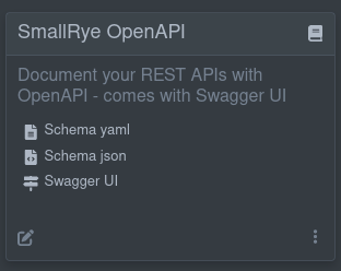
この良い例は、生成された OpenAPI スキーマへのリンクが JSON および YAML 形式の両方で含まれており、Swagger UI へのリンクも含まれている SmallRye OpenAPI エクステンションです。
これらの外部リンクはビルド時に判明しています。したがって、カードにこのようなリンクを表示するには、エクステンションに次のビルドステップを追加します:
@BuildStep(onlyIf = IsLocalDevelopment.class)(1)
public CardPageBuildItem pages(NonApplicationRootPathBuildItem nonApplicationRootPathBuildItem) {

    CardPageBuildItem cardPageBuildItem = new CardPageBuildItem(); (2)

    cardPageBuildItem.addPage(Page.externalPageBuilder("Schema yaml") (3)
            .url(nonApplicationRootPathBuildItem.resolvePath("openapi")) (4)
            .isYamlContent() (5)
            .icon("font-awesome-solid:file-lines")); (6)

    cardPageBuildItem.addPage(Page.externalPageBuilder("Schema json")
            .url(nonApplicationRootPathBuildItem.resolvePath("openapi") + "?format=json")
            .isJsonContent()
            .icon("font-awesome-solid:file-code"));

    cardPageBuildItem.addPage(Page.externalPageBuilder("Swagger UI")
            .url(nonApplicationRootPathBuildItem.resolvePath("swagger-ui"))
            .isHtmlContent()
            .icon("font-awesome-solid:signs-post"));

    return cardPageBuildItem;
}| 1 | このビルドステップは、ローカル開発モードの場合にのみ実行されるように常に確認してください。 |
| 2 | カードに何かを追加するには、CardPageBuildItem を返す/生成する必要があります。 |
| 3 | リンクを追加するには、すべてのリンクが「ページ」に移動するため、addPage メソッドを使用できます。Page には、ページの構築を支援するいくつかのビルダーがあります。external リンクには、externalPageBuilder を使用します。 |
| 4 | 外部リンクの URL を追加します (この場合、このリンクは設定可能な非アプリケーションパス (デフォルトは /q) の下にあるため、 NonApplicationRootPathBuildItem を使用してこのリンクを作成します)。リンクが /q の下にある場合は、必ず NonApplicationRootPathBuildItem を使用します。 |
| 5 | 移動先のコンテンツのコンテンツタイプを (オプションで) ヒントとして指定できます。ヒントがない場合、MediaType を判断するためにヘッダー呼び出しが行われます。 |
| 6 | アイコンを追加できます。すべての無料の font-awesome アイコンが利用可能です。 |
外部コンテンツの埋め込み
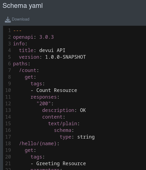
デフォルトでは、外部リンクであっても Dev UI 内で (埋め込みで) レンダリングされます。HTML の場合、ページがレンダリングされ、その他のコンテンツはメディアタイプをマークアップするために code-mirror を使用して表示されます。たとえば、YAML 形式の OpenAPI スキーマドキュメントは次のようになります:
コンテンツを埋め込みたくない場合は、Page Builder で .doNotEmbed() を使用できます。これにより、リンクが新しいタブで開かれます。
ランタイム外部リンク
上記の例では、ビルド時に使用するリンクが判明していることを前提としていますが、ランタイム時にのみリンクがわかる場合もあります。その場合は、追加するリンクを返す JsonRPC メソッド (後述) を使用し、リンク作成時にそれを利用できます。ページビルダーで .url メソッドを使用する代わりに、 .dynamicUrlJsonRPCMethodName("yourJsonRPCMethodName") を使用します。
RPC メソッドがパラメーターを受け入れる場合、それらをメソッド .dynamicUrlJsonRPCMethodName("yourJsonRPCMethodName", Map.of("parameter-name", "parameter-value)) に追加できます。RPC メソッドのルックアップは、デフォルトでエクステンションの名前空間になります。他のエクステンションの名前空間の RPC メソッドは、メソッド名の前に名前空間を付けて .dynamicUrlJsonRPCMethodName("otherNamespace:jsonRPCMethodName") のように使用できます。
たとえば、以下のページ定義は、devui-dev-services:devServicesConfig JsonRPC メソッドをランタイム時に呼び出し、my-dev-service という名前の dev service への URL を取得します:
cardPageBuildItem.addPage(Page.externalPageBuilder("External Page")
                .dynamicUrlJsonRPCMethodName("devui-dev-services:devServicesConfig", (1)
                    Map.of("name", "my-dev-service", (2)
"configKey", "url-config-key")));| 1 | 名前空間 devui-dev-services から devServicesConfig RPC メソッドを使用します。 |
| 2 | RPC メソッドが必要とするパラメーター (name と configKey) を設定します。 |
生データページ
ビルド時に既知のデータ (ビルド時データ) を表示したい場合は、 Page で次のいずれかのビルダーを使用できます。
マークアップされたデータ
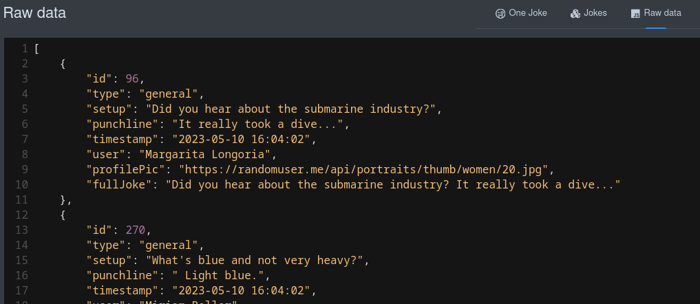
これは、データを生の (シリアル化された) JSON 値で表示します。
cardPageBuildItem.addPage(Page.rawDataPageBuilder("Raw data") (1)
                .icon("font-awesome-brands:js")
.buildTimeDataKey("someKey")); (2)| 1 | rawDataPageBuilder を使用します。 |
| 2 | Page BuildItem の addBuildTimeData でビルド時データを追加したときに使用したキーに戻るリンクです。 |
これにより、生データを JSON でレンダリングするページへのリンクが作成されます。
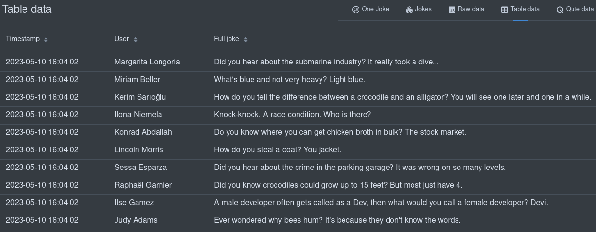
テーブルデータ
構造が許す場合、ビルド時データをテーブルで表示することもできます。
cardPageBuildItem.addPage(Page.tableDataPageBuilder("Table data") (1)
                .icon("font-awesome-solid:table")
                .showColumn("timestamp") (2)
                .showColumn("user") (2)
                .showColumn("fullJoke") (2)
.buildTimeDataKey("someKey")); (3)| 1 | tableDataPageBuilder を使用します。 |
| 2 | オプションで特定のフィールドのみを表示できます。 |
| 3 | Page BuildItem の addBuildTimeData でビルド時データを追加したときに使用したキーに戻るリンクです。 |
これにより、テーブル内のデータをレンダリングするページへのリンクが作成されます。
Qute データ
Qute テンプレートを使用してビルド時データを表示することもできます。すべてのビルド時データキーは、テンプレートで使用可能です。
cardPageBuildItem.addPage(Page.quteDataPageBuilder("Qute data") (1)
                .icon("font-awesome-solid:q")
.templateLink("qute-jokes-template.html")); (2)| 1 | quteDataPageBuilder を使用します。 |
| 2 | /deployment/src/main/resources/dev-ui/ 内の Qute テンプレートへのリンクです。 |
データを表示するには、任意の Qute テンプレートを使用できます。例えば、 qute-jokes-template.html です。
<table>
    <thead>
        <tr>
            <th>Timestamp</th>
            <th>User</th>
            <th>Joke</th>
        </tr>
    </thead>
    <tbody>
        {#for joke in jokes} (1)
        <tr>
            <td>{joke.timestamp}</td>
            <td><span><img src="{joke.profilePic}" height="30px"></img> {joke.user}</span></td>
            <td>{joke.fullJoke}</td>
        </tr>
        {/for}
    </tbody>
</table>| 1 | Page Build Item に jokes がビルド時データキーとして追加されました。 |
バックエンドとの通信
バックエンドとのすべての通信は、ウェブソケットを介した JsonRPC で行われます。Dev UI は、エクステンション開発者にとってこれを使いやすくしており、JsonRPC や Web ソケットのいずれかの詳細に深く踏み込む必要はありません。
実行時 (ユーザーが開発モードでアプリケーションを実行しているとき) にバックエンドと通信するには、3つの段階があります。
-
ランタイムクラスパスに対してメソッドを実行する
-
デプロイメントクラスパスに対してメソッドを実行する
-
記録された値からデータを返す
ランタイムクラスパスに対する JsonRPC
ランタイムデータ (以前に議論したビルド時データではなく) をフェッチまたはストリーミングしたり、ランタイムクラスパスに対してメソッドを実行したりできます (デプロイメントクラスパスとは対照的に)。実行時にデータを取得するには2つのパートがあります。ランタイムまたは runtime-dev モジュールの Java 側と、Web コンポーネントでの使用 (これについては後で説明します) です。
Runtime または Runtime-dev モジュールで JsonRPC サービスを作成します。このクラスは、Bean を明示的にスコープ指定しない場合を除き、デフォルトでアプリケーションスコープの Bean となります。何かを返すすべての public メソッドは、Web コンポーネントの Javascript から呼び出し可能になります。
これらのメソッドで返されるオブジェクトは次のとおりです。
-
プリミティブまたは
String、 -
io.vertx.core.json.JsonArray -
io.vertx.core.json.JsonObject -
JSON にシリアル化できるその他の POJO
上記のすべては、ブロッキング (POJO) またはノンブロッキング (@NonBlocking または Uni) にすることができます。あるいは、 Multi を使用してデータをストリーミングすることも可能です。
(1)
public class JokesJsonRPCService {

    private final BroadcastProcessor<Joke> jokeStream = BroadcastProcessor.create();
    private final BroadcastProcessor<Joke> jokeLog = BroadcastProcessor.create();
    private static int numberOfJokesTold = 10;

    @PostConstruct
    void init() {
        Multi.createFrom().ticks().every(Duration.ofMinutes(1)).subscribe().with((item) -> {
            jokeStream.onNext(getJoke());
        });
    }

    public Multi<Joke> streamJokes() { (2)
        return jokeStream;
    }

    @NonBlocking (3)
    public Joke getJoke() {
        numberOfJokesTold++;
        Joke joke = fetchRandomJoke();
        jokeLog.onNext(joke);
        return joke;
    }

    public Multi<Joke> jokeLog() {
        return jokeLog;
    }

    // Some more private methods
}| 1 | スコープ指定されていないクラスは、デフォルトでアプリケーションスコープになります。 |
| 2 | Multi を使用してデータをストリーミングできます |
| 3 | この例はノンブロッキングで実行されます。 Uni<Joke> を返すこともできます。 |
このコードは、UI に表示するためのデータを利用可能にする役割を担います。
デプロイメントモジュールのプロセッサーに JsonPRCService を登録する必要があります。
@BuildStep
JsonRPCProvidersBuildItem createJokesJsonRPCService() {(1)
    return new JsonRPCProvidersBuildItem(JokesJsonRPCService.class);(2)
}| 1 | JsonRPCProvidersBuildItem を生成または返します。 |
| 2 | UI でデータを利用可能にするメソッドを含むクラスを、runtime または runtime-dev モジュールで定義します。 |
新しい runtime-dev モジュールを作成する場合は、runtime モジュールの pom.xml に条件付き Dev 依存関係も追加する必要があります。
<plugin>
    <groupId>io.quarkus</groupId>
    <artifactId>quarkus-extension-maven-plugin</artifactId>
    <configuration>
        <conditionalDevDependencies>
            <artifact>${project.groupId}:${project.artifactId}-dev:${project.version}</artifact>
        </conditionalDevDependencies>
        ...
    </configuration>
</plugin>
デプロイメントクラスパスに対する JsonRPC
特定のケースでは、デプロイメントクラスパスに対してメソッドを実行したり、データを取得したりする必要があるかもしれません。これも JsonRPC 通信を介して行われますが、この場合、ランタイムモジュールに JsonRPC サービスを作成するのではなく、
デプロイメントモジュールのサプライヤーで実行するコードを提供するだけです。これを行うには、 BuildTimeActionBuildItem を生成します。例:
    @BuildStep(onlyIf = IsLocalDevelopment.class)
    BuildTimeActionBuildItem createBuildTimeActions() { (1)
        BuildTimeActionBuildItem generateManifestActions = new BuildTimeActionBuildItem(); (2)

        generateManifestActions.actionBuilder()
            .methodName("generateManifests")(3)
            .function(params -> { (4)
                try {
                    List<Manifest> manifests = holder.getManifests();
                    // Avoid relying on databind.
                    Map<String, String> map = new LinkedHashMap<>();
                    for (Manifest manifest : manifests) {
                        map.put(manifest.getName(), manifest.getContent());
                    }
                    return map;
                } catch (Exception e) {
                    throw new RuntimeException(e);
                }
            }).build();

        return generateManifestActions;
}| 1 | BuildProducer を返すか、または使用して BuildTimeActionBuildItem を作成します |
| 2 | BuildTimeActionBuildItem は、エクステンションの名前空間で自動的にスコープ指定されます。 |
| 3 | メソッド名 (任意の json-rpc サービスと同様に js から呼び出し可能) は generateManifests です。 |
| 4 | ここでは、UI からこのアクションが要求されたときに実行される関数を追加します。パラメーターがある場合、それらはマップ (params) で利用可能です。 |
アクションとして CompletableFuture/CompletionStage を返すこともできます。データをストリーミングする場合は、 addAction ではなく addSubscription を使用して Flow.Publisher を返す必要があります。デプロイメントとランタイムのクラスパス間でデータを渡す必要があるため、Uni と Multi は使用できません。したがって、JDK クラスを使用するのが安全なオプションです。
記録された値に対する JsonRPC
記録されたデータを UI に渡す方法は、上記のデプロイメントクラスパスと同じですが、関数ではなく RuntimeValue (レコーダーから返されるもの) を渡します。
@BuildStep(onlyIf = IsLocalDevelopment.class)
BuildTimeActionBuildItem createBuildTimeActions() {
    BuildTimeActionBuildItem actionBuildItem = new BuildTimeActionBuildItem();
        actionBuildItem.actionBuilder()
                .methodName("getMyRecordedValue")
                .runtime(runtimeValue) (1)
                .build();
    return actionBuildItem;
}| 1 | レコーダーから返される RuntimeValue を設定します。 |
Web コンポーネント (ページ) 内の JsonRPC
組み込みの JsonRPC コントローラーを使用して、定義した任意のメソッドにアクセスできます。ランタイム、デプロイメント、記録済みはすべて Web コンポーネントで同じように機能します。
import { JsonRpc } from 'jsonrpc';

// ...

jsonRpc = new JsonRpc(this); // Passing in this will scope the RPC calls to your extension

// ...

connectedCallback() {
    super.connectedCallback();
    this.jsonRpc.getJoke().then(jsonRpcResponse => { (1)
        this._addToJokes(jsonRpcResponse.result); (2)
    });
}| 1 | getJoke メソッドは Java サービスのメソッドに対応していることに注意してください。このメソッドは、JsonRPC の結果を含む Promise を返します。 |
| 2 | この場合、結果はオブジェクトなので、ジョークのリストに追加します。サーバーが何らかのコレクションを返した場合、これは配列になることもあります。 |
JsonArray (または任意の Java コレクション) は、ブロッキングまたは非ブロッキングであれば配列を返します。それ以外の場合は、JsonObject が返されます。
呼び出されるメソッドにパラメーターを渡すこともできます。以下はその例です (ランタイム Java コード内)。
public Uni<JsonObject> clear(String name) { (1)
    Optional<Cache> cache = manager.getCache(name);
    if (cache.isPresent()) {
        return cache.get().invalidateAll().map((t) -> getJsonRepresentationForCache(cache.get()));
    } else {
        return Uni.createFrom().item(new JsonObject().put("name", name).put("size", -1));
    }
}| 1 | clear メソッド は、name というパラメーターを1つ取ります。 |
Webcomponent (Javascript) の場合:
_clear(name) {
    this.jsonRpc.clear({name: name}).then(jsonRpcResponse => { (1)
        this._updateCache(jsonRpcResponse.result)
    });
}| 1 | name パラメーターが渡されます。 |
ストリーミングデータ
データを継続的に画面にストリーミングすることで、UI 画面を最新のデータで更新することができます。これは、 Multi (Java 側) と Observer (Javascript 側) で実行できます。
ストリーミングデータの Java 側:
public class JokesJsonRPCService {

    private final BroadcastProcessor<Joke> jokeStream = BroadcastProcessor.create();

    @PostConstruct
    void init() {
        Multi.createFrom().ticks().every(Duration.ofHours(4)).subscribe().with((item) -> {
            jokeStream.onNext(getJoke());
        });
    }

    public Multi<Joke> streamJokes() { (1)
        return jokeStream;
    }

    // ...
}| 1 | ジョークをストリーミングする Multi を返します |
ストリーミングデータの Javascript 側:
this._observer = this.jsonRpc.streamJokes().onNext(jsonRpcResponse => { (1)
    this._addToJokes(jsonRpcResponse.result);
    this._numberOfJokes = this._numberOfJokes++;
});

// ...

this._observer.cancel(); (2)| 1 | メソッドを呼び出し (オプションでパラメーターを渡す)、次のイベントで呼び出されるコードを提供できます。 |
| 2 | 必要に応じて後でキャンセルできるように、オブザーバーのインスタンスを保管してください。 |
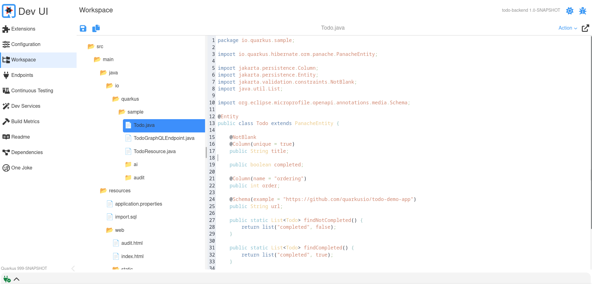
ワークスペース
エクステンションは、ワークスペース内の項目に アクション を提供できます。
アクションは、ワークスペース項目を入力として受け取る JsonRPC メソッドです。
これを行うには、プロセッサーで WorkspaceActionBuildItem を返すか生成します。
    @BuildStep(onlyIf = IsLocalDevelopment.class)
    WorkspaceActionBuildItem createWorkspaceActions() {
        ActionBuilder actionBuilder = Action.actionBuilder() (1)
                .label("Joke") (2)
                .function((t) -> { (3)
                    // Here do something with the input and return something
                    String content = t.content;
                    // ....
                    return t;
                })
                .display(Display.split) (4)
                .displayType(DisplayType.markdown) (5)
                .filter(Patterns.ANY_JAVA); (6)

        return new WorkspaceActionBuildItem(actionBuilder);
}| 1 | actionBuilder を使用して新しいアクションを作成します。 |
| 2 | ラベルは、ワークスペースページのドロップダウンアクションに表示されるものです |
| 3 | ユーザーがこのアクションを選択した場合に実行されるコードがここにあります。いくつかの入力 (以下の Input セクションを参照) を受け取ります。 |
| 4 | 結果の表示方法 (以下の Display セクションを参照) |
| 5 | 結果のタイプ (以下の DisplayType セクションを参照) |
| 6 | このアクションが特定の項目にのみ適用される場合のオプションのフィルター。正規表現を入力として受け取り、いくつかの事前定義された正規表現が Patterns クラスに存在します。 |
入力
関数が受け取る入力は次のとおりです。
-
actionId: 一意の (自動スコープの) アクション ID
-
name: アイテム (またはファイル) 名
-
path: そのアイテム (またはファイル) への完全パス
-
content: このアイテム (またはファイル) の内容
-
type: タイプ (例: text/plain)
詳細: カスタムカード
デフォルトの内蔵カードを使用したくない場合は、エクステンションページに表示されるカードをカスタマイズできます。
これを行うには、提供されたカードの代わりにロードされる Web コンポーネントを提供し、これを Java プロセッサーに登録する必要があります。
cardPageBuildItem.setCustomCard("qwc-mycustom-card.js");JavaScript 側では、すべてのページにアクセスできます (リンクを作成する場合)。
import { pages } from 'build-time-data';そして、以下のプロパティーが渡されます。
-
extensionName
-
description
-
guide
-
namespace
-
logoUrl
static properties = {
    extensionName: {type: String},
    description: {type: String},
    guide: {type: String},
    namespace: {type: String},
    logoUrl: {type: String}
}
Dev UI Log
999-SNAPSHOT バージョンを使用してローカルアプリケーションを実行すると、Dev UI のフッターに Dev UI Log が表示されます。これは、ブラウザーと Quarkus アプリ間でやり取りされるすべての JSON RPC メッセージをデバッグする場合に役立ちます。
Quarkus コアの外部でエクステンション (Quarkiverse など) を開発している場合、Quarkus のバージョンが 999-SNAPSHOT ではないことがあります。その場合でも、このアプリケーションプロパティー quarkus.dev-ui.show-json-rpc-log=true を使用して Dev UI Log を有効にできます。
詳細: ヘッドレスコンポーネント
まれに、エクステンションが メインコンポーネントが DOM に追加されていない場合でも ロジックを実行する必要があることがあります。これは通常、UI を表示せずにグローバル状態を設定したり、バックグラウンドタスクをトリガーしたりするのに役立ちます。
これをサポートするために、エクステンションは ヘッドレスコンポーネント を宣言できます。これは、視覚的な表現がなく、ページロード時に自動的に実行される Web コンポーネントです。
エクステンションでヘッドレスコンポーネントを宣言します。
CardPageBuildItem cardPageBuildItem = new CardPageBuildItem();
cardPageBuildItem.setHeadlessComponentLink("qwc-chappie-init.js"); (1)| 1 | ヘッドレスコンポーネントの JavaScript ファイルへのパスを設定します (エクステンションリソースからの相対パス)。 |
次に、他の Dev UI ページと一緒にコンポーネントを作成します。
import { LitElement } from 'lit';
import { JsonRpc } from 'jsonrpc';
import { assistantState } from 'assistant-state';

/**
 * This load on browser load (headless components) to set the initial assistant state
 */
class QwcChappieInit extends LitElement {

    static properties = {
        namespace: {attribute: true}, (1)
    }

    connectedCallback() {
        super.connectedCallback();
        this._init().then(() => this.remove()); (2)
    }

    async _init() {
        const jsonRpc = new JsonRpc(this.namespace); (3)

        jsonRpc.loadConfiguration().then(jsonRpcResponse => {
            if(jsonRpcResponse.result && jsonRpcResponse.result.name){
                assistantState.ready();
            }else{
                assistantState.available();
            }
        });
    }

    // prevent rendering anything
    createRenderRoot() { (3)
        return this;
    }
}
customElements.define('qwc-chappie-init', QwcChappieInit); (4)| 1 | namespace 属性は、Dev UI によって常に自動的に提供されます。 |
| 2 | connectedCallback でロジックを実行し、不要になったら要素を削除します。 |
| 3 | JsonRPC を使用する場合は、(通常のコンポーネントのように this ではなく) 提供された名前空間を渡します。 |
| 4 | タグ定義は、.js を含まないファイル名である必要があります。 |
テスト
エクステンションに、以下をテストするテストを追加できます。
-
ビルド時データ
-
JsonRPC 経由の実行時データ
これを pom に追加する必要があります。
<dependency>
    <groupId>io.quarkus</groupId>
    <artifactId>quarkus-devui-test-spi</artifactId>
    <scope>test</scope>
</dependency>
これにより、これらのテストを作成するための 2 つのベースクラスにアクセスできるようになります。
ビルド時データのテスト
ビルド時データを追加した場合の例:
cardPageBuildItem.addBuildTimeData("somekey", somevalue);ビルド時データが正しく生成されていることをテストするには、 DevUIBuildTimeDataTest を拡張するテストを追加できます。
public class SomeTest extends DevUIBuildTimeDataTest {

    @RegisterExtension
    static final QuarkusDevModeTest config = new QuarkusDevModeTest().withEmptyApplication();

    public SomeTest() {
        super("my-extension-artifactId");
    }

    @Test
    public void testSomekey() throws Exception {
        JsonNode somekeyResponse = super.getBuildTimeData("somekey");
        Assertions.assertNotNull(somekeyResponse);

        // Check more values on somekeyResponse
    }

}
実行時データのテスト
実行時データレスポンスが含まれる JsonRPC サービスを追加した場合の例:
public boolean updateProperties(String content, String type) {
    // ...
}
updateProperties が JsonRPC 経由で正しく実行されることをテストするには、 DevUIJsonRPCTest を拡張するテストを追加できます。
他の依存関係によってまだ追加されていない場合、次の依存関係も pom に追加する必要がある場合があります。追加しないと、テスト中に Dev UI が起動しません。
<dependency>
    <groupId>io.quarkus</groupId>
    <artifactId>quarkus-vertx-http-deployment</artifactId>
    <scope>test</scope>
</dependency>
public class SomeTest extends DevUIJsonRPCTest {
@RegisterExtension
static final QuarkusDevModeTest config = new QuarkusDevModeTest().withEmptyApplication();
public SomeTest() {
super("my-extension-artifactId");
}
@Test
public void testUpdateProperties() throws Exception {
JsonNode updatePropertyResponse = super.executeJsonRPCMethod("updateProperty",
Map.of(
"name", "quarkus.application.name",
"value", "changedByTest"));
Assertions.assertTrue(updatePropertyResponse.asBoolean());
// Get the properties to make sure it is changed
JsonNode allPropertiesResponse = super.executeJsonRPCMethod("getAllValues");
String applicationName = allPropertiesResponse.get("quarkus.application.name").asText();
Assertions.assertEquals("changedByTest", applicationName);
}
}