Dev UI
|
Dev UI v2
This guide covers the Dev UI v2, which is the default from Quarkus 3 onwards. Read Dev UI v1 for Quarkus 2.x. |
このガイドでは、 エクステンションの作成者向けにQuarkus Dev UIについて説明します。
Quarkus には Developer UI が搭載されており、dev モード (mvn quarkus:dev で Quarkus を起動) で使用可能で、
デフォルトで /q/dev-ui に存在し、次のような画面が表示されます。
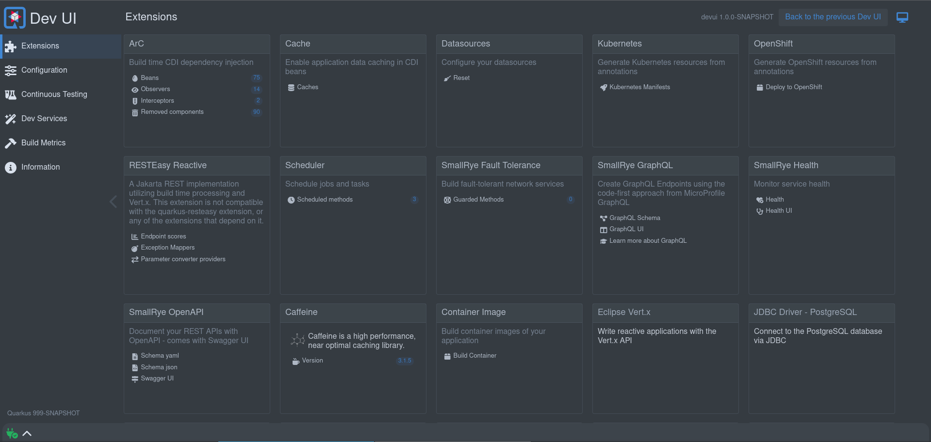
これにより、次のことが可能になります:
-
quickly visualise all the extensions currently loaded
-
エクステンションのステータス表示とドキュメントへの直接移動
-
Configurationの表示と変更 -
manage and visualise
Continuous Testing -
Dev Servicesの情報の表示 -
ビルド情報の表示
-
様々なログを表示、ストリーミング
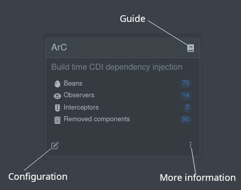
Each extension used in the application will be listed and you can navigate to the guide for each extension, see some more information on the extension, and view configuration applicable for that extension:
エクステンションで Dev UI を拡張する
エクステンションをDev UIに表示させるためには、何もする必要はありません!
だから、いつでもそれから始めることができます :)
Extension can:
エクステンションカードにリンクを追加
外部リンク
These are links that reference other (external from Dev UI) data. This data can be HTML pages, text or other data.
A good example of this is the SmallRye OpenAPI extension that contains links to the generated openapi schema in both json and yaml format, and a link to Swagger UI:
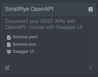
The links to these external references is know at build time, so to get links like this on your card, all you need to do is add the following Build Step in your extension:
@BuildStep(onlyIf = IsDevelopment.class)(1)
public CardPageBuildItem pages(NonApplicationRootPathBuildItem nonApplicationRootPathBuildItem) {

    CardPageBuildItem cardPageBuildItem = new CardPageBuildItem(); (2)

    cardPageBuildItem.addPage(Page.externalPageBuilder("Schema yaml") (3)
            .url(nonApplicationRootPathBuildItem.resolvePath("openapi")) (4)
            .isYamlContent() (5)
            .icon("font-awesome-solid:file-lines")); (6)

    cardPageBuildItem.addPage(Page.externalPageBuilder("Schema json")
            .url(nonApplicationRootPathBuildItem.resolvePath("openapi") + "?format=json")
            .isJsonContent()
            .icon("font-awesome-solid:file-code"));

    cardPageBuildItem.addPage(Page.externalPageBuilder("Swagger UI")
            .url(nonApplicationRootPathBuildItem.resolvePath("swagger-ui"))
            .isHtmlContent()
            .icon("font-awesome-solid:signs-post"));

    return cardPageBuildItem;
}| 1 | Always make sure that this build step only run when dev mode |
| 2 | To add anything on the card, you need to return/produce a CardPageBuildItem. |
| 3 | To add a link, you can use the addPage method, as all links go to a "page". Page has got some builders to assist with building a page. For external links, use the externalPageBuilder |
| 4 | Adding the url of the external link (in this case we use NonApplicationRootPathBuildItem to create this link, as this link is under the configurable non application path, default /q). Always use NonApplicationRootPathBuildItem if your link is available under /q. |
| 5 | 移動先のコンテンツのコンテンツタイプを (オプションで) ヒントとして表示できます。ヒントがない場合、 MediaType を決定するためにヘッダー呼び出しが実行されます。 |
| 6 | アイコンを追加できます。無料の font-awesome アイコンが利用可能です。 |
|
アイコンに関する注意事項
If you find your icon at Font awesome, you can map as follow: Example <i class="fa-solid fa-house"></i> will map to font-awesome-solid:house, so fa becomes font-awesome and for the icon name, remove the fa-;
|
外部コンテンツの埋め込み
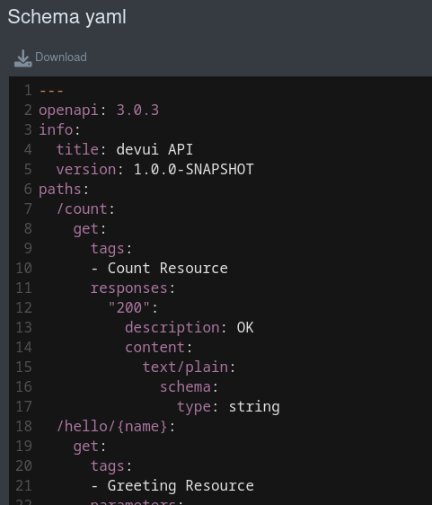
By default, even external links will render inside (embedded) in Dev UI. In the case of HTML the page will be rendered and any other content will be shown using code-mirror to markup the media type, for example the open api schema document in yaml format:
If you do not want to embed the content, you can use the .doNotEmbed() on the Page Builder, this will then open a new tab.
ランタイム外部リンク
The example above assumes you know the link to use at build time. There might be cases where you only know this at runtime. In that case you can use a JsonRPC Method that returns the link to add and use that when creating the link. Rather than using the .url method on the page builder, use the .dynamicUrlJsonRPCMethodName("yourJsonRPCMethodName").
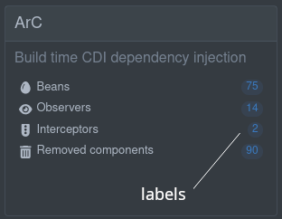
ラベルの追加
ページビルダーのビルダーメソッドの 1 つを使用して、カード内のリンクにオプションラベルを追加できます。以下のラベルがあります。
-
静的 (ビルド時に既知のラベル)
.staticLabel("staticLabelValue") -
動的 (実行時にロード)
.dynamicLabelJsonRPCMethodName("yourJsonRPCMethodName") -
ストリーミング (実行時に更新される値の継続的なストリーミング)値を継続的にストリーミング
.streamingLabelJsonRPCMethodName("yourJsonRPCMethodName")
For dynamic and streaming labels, see the JsonRPC Section.
ページ全体の追加
"内部" ページ (上記の "外部" ページとは対照的) にリンクすることもできます。つまり、ページをビルドし、Dev UI でレンダリングするためのデータとアクションを追加できます。
ビルド時データ
To make build time data available in your full page, you can add any data to your CardPageBuildItem with a key and a value:
CardPageBuildItem pageBuildItem = new CardPageBuildItem();
pageBuildItem.addBuildTimeData("someKey", getSomeValueObject());
ページに必要なことがビルド時にわかっているすべてのデータに対して、これらのキーと値のペアを複数追加できます。
Dev UI にページ全体のコンテンツを追加する方法としては、いくつかのオプションがあります。最も基本的なもの (入門向け) から本格的な Web コンポーネント (推奨) まであります。
ビルド時データを画面に表示します (フロントエンドのコーディングは不要)。
If you have some data that is known at build time that you want to display you can use one of the following builders in Page:
生データ
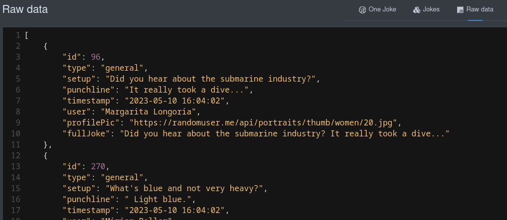
This will display your data in it’s raw (serialised) json value:
cardPageBuildItem.addPage(Page.rawDataPageBuilder("Raw data") (1)
                .icon("font-awesome-brands:js")
.buildTimeDataKey("someKey")); (2)| 1 | rawDataPageBuilder を使用します。 |
| 2 | Page BuildItem の addBuildTimeData でビルド時データを追加したときに使用したキーにリンクします。 |
That will create a link to a page that renders the raw data in json:
テーブルデータ
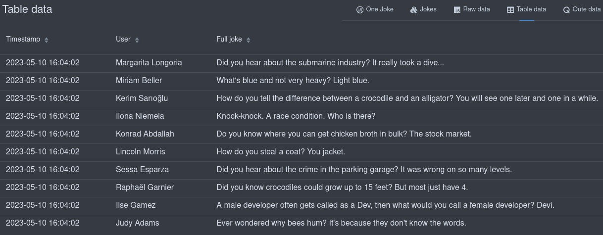
構造上可能な場合は、ビルド時データをテーブルに表示することもできます。
cardPageBuildItem.addPage(Page.tableDataPageBuilder("Table data") (1)
                .icon("font-awesome-solid:table")
                .showColumn("timestamp") (2)
                .showColumn("user") (2)
                .showColumn("fullJoke") (2)
.buildTimeDataKey("someKey")); (3)| 1 | tableDataPageBuilder を使用します。 |
| 2 | オプションで特定のフィールドのみを表示します。 |
| 3 | Page BuildItem の addBuildTimeData でビルド時データを追加したときに使用したキーにリンクします。 |
これにより、テーブル内のデータをレンダリングするページへのリンクが作成されます。
Qute データ
You can also display your build time data using a qute template. All build time data keys is available to use int the template:
cardPageBuildItem.addPage(Page.quteDataPageBuilder("Qute data") (1)
                .icon("font-awesome-solid:q")
.templateLink("qute-jokes-template.html")); (2)| 1 | quteDataPageBuilder を使用します。 |
| 2 | /deployment/src/main/resources/dev-ui/ の Qute テンプレートにリンクします。 |
Using any qute template to display the data, example qute-jokes-template.html:
<table>
    <thead>
        <tr>
            <th>Timestamp</th>
            <th>User</th>
            <th>Joke</th>
        </tr>
    </thead>
    <tbody>
        {#for joke in jokes} (1)
        <tr>
            <td>{joke.timestamp}</td>
            <td><span><img src="{joke.profilePic}" height="30px"></img> {joke.user}</span></td>
            <td>{joke.fullJoke}</td>
        </tr>
        {/for}
    </tbody>
</table>| 1 | Page Build Item のビルド時データキーとして jokes が追加されました。 |
Web Component page
To build an interactive page with actions and runtime (or built time) data, you need to use the web component page:
cardPageBuildItem.addPage(Page.webComponentPageBuilder() (1)
                    .icon("font-awesome-solid:egg")
                    .componentLink("qwc-arc-beans.js") (2)
.staticLabel(String.valueOf(beans.size())));| 1 | webComponentPageBuilder を使用します。 |
| 2 | Link to the Web Component in /deployment/src/main/resources/dev-ui/. The title can also be defined (using .title("My title") in the builder), but if not the title will be assumed from the componentLink, that should always have the format qwc (stands for Quarkus Web Component) dash extensionName (example, arc in this case ) dash page title ("Beans" in this case) |
Dev UI は、これらの Web コンポーネントの構築を容易にするために Lit を使用します。Web コンポーネントと Lit の詳細は、以下を参照してください。
Web コンポーネントページの基本構造
Web コンポーネントページは、新しい HTML 要素を作成する JavaScript クラスです。
import { LitElement, html, css} from 'lit'; (1)
import { beans } from 'build-time-data'; (2)

/**
 * This component shows the Arc Beans
 */
export class QwcArcBeans extends LitElement { (3)

    static styles = css` (4)
        .annotation {
          color: var(--lumo-contrast-50pct); (5)
        }

        .producer {
          color: var(--lumo-primary-text-color);
        }
        `;

    static properties = {
        _beans: {state: true}, (6)
    };

    constructor() { (7)
        super();
        this._beans = beans;
    }

    render() { (8)
        if (this._beans) {
            return html`<ul>
                ${this._beans.map((bean) => (9)
                    html`<li>${bean.providerType.name}</li>`
                )}</ul>`;
        } else {
            return html`No beans found`;
        }
    }
}
customElements.define('qwc-arc-beans', QwcArcBeans); (10)| 1 | You can import Classes and/or functions from other libraries.
In this case we use LitElement class and html & css functions from Lit |
| 2 | Build time data as defined in the Build step can be imported using the key and always from build-time-data. All keys added in your Build step will be available. |
| 3 | The component should be named in the following format: Qwc (stands for Quarkus Web Component) then Extension Name then Page Title, all concatenated with Camel Case. This will also match the file name format as described earlier. The component should also extend LitComponent. |
| 4 | CSS スタイルは css 関数を使用して追加でき、これらのスタイルはコンポーネントにのみ適用されます。 |
| 5 | Styles can reference globally defined CSS variables to make sure your page renders correctly, especially when switching between light and dark mode. You can find all CSS variables in the Vaadin documentation (Color, Sizing and Spacing, etc) |
| 6 | Properties can be added. Use _ in front of a property if that property is private. Properties are usually injected in the HTML template, and can be defined as having state, meaning that if that property changes, the component should re-render. In this case, the beans are Build time data and only change on hot-reload, that we will cover later. |
| 7 | Constructors (optional) should always call super first, and then set the default values for the properties. |
| 8 | The render method (comes from LitElement will be called to render the page). In this method you return the markup of the page you want. You can use the html function from Lit, that gives you a template language to output the HTML you want. Once the template is created, you only need to set/change the properties to re-render the page content. Read more about Lit html |
| 9 | 組み込みのテンプレート関数を使用して、conditional、list などを実行できます。詳細は、 Lit テンプレート を参照してください。 |
| 10 | You always need to register your Web component as a custom element, with a unique tag. Here the tag will follow the same format as the filename (qwc dash extension name dash page title ); |
レンダリングに Vaadin UI コンポーネントを使用する
Dev UI では、UI ビルディングブロックとして Vaadin Web コンポーネント を広範に使用します。
たとえば、Arc Beans は Vaadin Grid を使用してレンダリングされます。
import { LitElement, html, css} from 'lit';
import { beans } from 'build-time-data';
import '@vaadin/grid'; (1)
import { columnBodyRenderer } from '@vaadin/grid/lit.js'; (2)
import '@vaadin/vertical-layout';
import 'qui-badge'; (3)

/**
 * This component shows the Arc Beans
 */
export class QwcArcBeans extends LitElement {

    static styles = css`
        .arctable {
          height: 100%;
          padding-bottom: 10px;
        }

        code {
          font-size: 85%;
        }

        .annotation {
          color: var(--lumo-contrast-50pct);
        }

        .producer {
          color: var(--lumo-primary-text-color);
        }
        `;

    static properties = {
        _beans: {state: true},
    };

    constructor() {
        super();
        this._beans = beans;
    }

    render() {
        if (this._beans) {

            return html`
                <vaadin-grid .items="${this._beans}" class="arctable" theme="no-border">
                    <vaadin-grid-column auto-width
                        header="Bean"
                        ${columnBodyRenderer(this._beanRenderer, [])}
                        resizable>
                    </vaadin-grid-column>

                    <vaadin-grid-column auto-width
                        header="Kind"
                        ${columnBodyRenderer(this._kindRenderer, [])}
                        resizable>
                    </vaadin-grid-column>

                    <vaadin-grid-column auto-width
                        header="Associated Interceptors"
                        ${columnBodyRenderer(this._interceptorsRenderer, [])}
                        resizable>
                    </vaadin-grid-column>
                </vaadin-grid>`;

        } else {
            return html`No beans found`;
        }
    }

    _beanRenderer(bean) {
        return html`<vaadin-vertical-layout>
      <code class="annotation">@${bean.scope.simpleName}</code>
      ${bean.nonDefaultQualifiers.map(qualifier =>
            html`${this._qualifierRenderer(qualifier)}`
        )}
      <code>${bean.providerType.name}</code>
      </vaadin-vertical-layout>`;
    }

    _kindRenderer(bean) {
      return html`
        <vaadin-vertical-layout>
          ${this._kindBadgeRenderer(bean)}
          ${this._kindClassRenderer(bean)}
        </vaadin-vertical-layout>
    `;
    }

    _kindBadgeRenderer(bean){
      let kind = this._camelize(bean.kind);
      let level = null;

      if(bean.kind.toLowerCase() === "field"){
        kind = "Producer field";
        level = "success";
      }else if(bean.kind.toLowerCase() === "method"){
          kind = "Producer method";
          level = "success";
      }else if(bean.kind.toLowerCase() === "synthetic"){
        level = "contrast";
      }

      return html`
        ${level
          ? html`<qui-badge level='${level}' small><span>${kind}</span></qui-badge>`
          : html`<qui-badge small><span>${kind}</span></qui-badge>`
        }`;
    }

    _kindClassRenderer(bean){
      return html`
          ${bean.declaringClass
            ? html`<code class="producer">${bean.declaringClass.simpleName}.${bean.memberName}()</code>`
            : html`<code class="producer">${bean.memberName}</code>`
          }
      `;
    }

    _interceptorsRenderer(bean) {
        if (bean.interceptors && bean.interceptors.length > 0) {
            return html`<vaadin-vertical-layout>
                          ${bean.interceptorInfos.map(interceptor =>
                              html`<div>
                                    <code>${interceptor.interceptorClass.name}</code>
                                    <qui-badge class="${bean.kind.toLowerCase()}" small pill><span>${interceptor.priority}</span></qui-badge>
                                  </div>`
                          )}
                        </vaadin-vertical-layout>`;
        }
    }

    _qualifierRenderer(qualifier) {
        return html`<code class="annotation">${qualifier.simpleName}</code>`;
    }

    _camelize(str) {
        return str.replace(/(?:^\w|[A-Z]|\b\w|\s+)/g, function (match, index) {
            if (+match === 0)
                return "";
            return index === 0 ? match.toUpperCase() : match.toLowerCase();
        });
    }
}
customElements.define('qwc-arc-beans', QwcArcBeans);| 1 | 使用する Vaadin コンポーネントをインポートします。 |
| 2 | 必要に応じて他の関数をインポートすることもできます。 |
| 3 | There are some internal UI component that you can use, described below |
Using internal UI components
Some internal UI components (under the qui namespace) is available to make certain things easier:
-
Card
-
Badge
-
Alert
-
Code block
-
IDE Link
Card
カード内のコンテンツを表示する Card コンポーネント。
import 'qui-card';<qui-card title="My title">
<div slot="content">
My contents
</div>
</qui-card>Badge
vaadin themed バッジに基づく Badge UI コンポーネント。

import 'qui-badge';You can use any combination of small, primary, pill, with icon and clickable with any level of default, success, warning, error, contrast or set your own colours.
<div class="badges">
    <h3>Badges</h3>
    <p>Badges wrap the Vaadin theme in a component.
        See <a href="https://vaadin.com/docs/latest/components/badge">https://vaadin.com/docs/latest/components/badge</a> for more info.
    </p>
    <div class="cards">
        <qui-card title="Small">
            <div slot="content">
                <div class="cardcontents">
                    <qui-badge small><span>Default</span></qui-badge>
                    <qui-badge level="success" small><span>Success</span></qui-badge>
                    <qui-badge level="warning" small><span>Warning</span></qui-badge>
                    <qui-badge level="error" small><span>Error</span></qui-badge>
                    <qui-badge level="contrast" small><span>Contrast</span></qui-badge>
                    <qui-badge background="pink" color="purple" small><span>Custom colours</span></qui-badge>
                </div>
            </div>
        </qui-card>
        <qui-card title="Primary">
            <div slot="content">
                <div class="cardcontents">
                    <qui-badge primary><span>Default primary</span></qui-badge>
                    <qui-badge level="success" primary><span>Success primary</span></qui-badge>
                    <qui-badge level="warning" primary><span>Warning primary</span></qui-badge>
                    <qui-badge level="error" primary><span>Error primary</span></qui-badge>
                    <qui-badge level="contrast" primary><span>Contrast primary</span></qui-badge>
                    <qui-badge background="pink" color="purple" primary><span>Custom colours</span></qui-badge>
                </div>
            </div>
        </qui-card>
        <qui-card title="Pill">
            <div slot="content">
                <div class="cardcontents">
                    <qui-badge pill><span>Default pill</span></qui-badge>
                    <qui-badge level="success" pill><span>Success pill</span></qui-badge>
                    <qui-badge level="warning" pill><span>Warning pill</span></qui-badge>
                    <qui-badge level="error" pill><span>Error pill</span></qui-badge>
                    <qui-badge level="contrast" pill><span>Contrast pill</span></qui-badge>
                    <qui-badge background="pink" color="purple" pill><span>Custom colours</span></qui-badge>
                </div>
            </div>
        </qui-card>
        <qui-card title="With icon">
            <div slot="content">
                <div class="cardcontents">
                    <qui-badge text="Default" icon="font-awesome-solid:circle-info">
                        <span>Default icon</span>
                    </qui-badge>
                    <qui-badge text="Success" level="success" icon="font-awesome-solid:check">
                        <span>Success icon</span>
                    </qui-badge>
                    <qui-badge text="Warning" level="warning" icon="font-awesome-solid:triangle-exclamation">
                        <span>Warning icon</span>
                    </qui-badge>
                    <qui-badge text="Error" level="error" icon="font-awesome-solid:circle-exclamation">
                        <span>Error icon</span>
                    </qui-badge>
                    <qui-badge text="Contrast" level="contrast" icon="font-awesome-solid:hand">
                        <span>Contrast icon</span>
                    </qui-badge>
                    <qui-badge text="Custom" background="pink" color="purple" icon="font-awesome-brands:redhat">
                        <span>Custom colours</span>
                    </qui-badge>
                </div>
            </div>
        </qui-card>
        <qui-card title="Icon only">
            <div slot="content">
                <div class="cardcontents">
                    <qui-badge icon="font-awesome-solid:clock"></qui-badge>
                    <qui-badge level="success" icon="font-awesome-solid:check"></qui-badge>
                    <qui-badge level="warning" icon="font-awesome-solid:triangle-exclamation"></qui-badge>
                    <qui-badge level="error" icon="font-awesome-solid:circle-exclamation"></qui-badge>
                    <qui-badge level="contrast" icon="font-awesome-solid:hand"></qui-badge>
                    <qui-badge level="contrast" background="pink" color="purple" icon="font-awesome-brands:redhat"></qui-badge>
                </div>
            </div>
        </qui-card>
        <qui-card title="Clickable">
            <div slot="content">
                <div class="cardcontents">
                    <qui-badge clickable @click=${() => this._info()}><span>Default</span></qui-badge>
                    <qui-badge clickable level="success" @click=${() => this._success()}><span>Success</span></qui-badge>
                    <qui-badge clickable level="warning" @click=${() => this._warning()}><span>Warning</span></qui-badge>
                    <qui-badge clickable level="error" @click=${() => this._error()}><span>Error</span></qui-badge>
                    <qui-badge clickable level="contrast" @click=${() => this._contrast()}><span>Contrast</span></qui-badge>
                    <qui-badge clickable background="pink" color="purple" @click=${() => this._info()}><span>Custom colours</span></qui-badge>
                </div>
            </div>
        </qui-card>
    </div>
</div>Alert
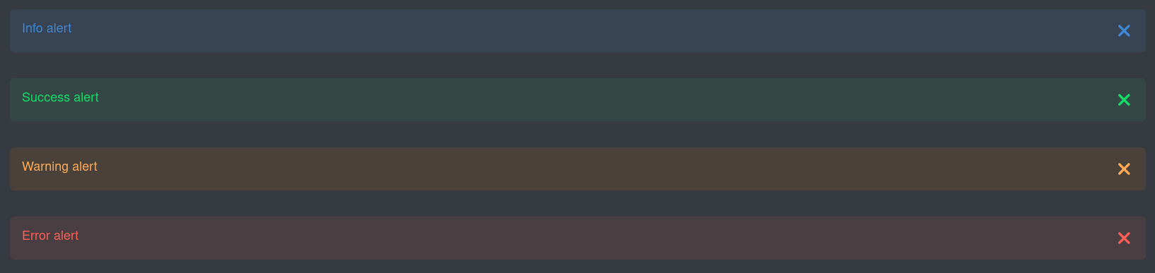
Alerts is modelled around the Bootstrap alerts. Click here for more info.
Also see Notification controller below as an alternative.
import 'qui-alert';<div class="cards">
<div class="cardcontents">
<qui-alert><span>Info alert</span></qui-alert>
<qui-alert level="success"><span>Success alert</span></qui-alert>
<qui-alert level="warning"><span>Warning alert</span></qui-alert>
<qui-alert level="error"><span>Error alert</span></qui-alert>
<hr class="line">
<qui-alert permanent><span>Permanent Info alert</span></qui-alert>
<qui-alert level="success" permanent><span>Permanent Success alert</span></qui-alert>
<qui-alert level="warning" permanent><span>Permanent Warning alert</span></qui-alert>
<qui-alert level="error" permanent><span>Permanent Error alert</span></qui-alert>
<hr class="line">
<qui-alert center><span>Center Info alert</span></qui-alert>
<qui-alert level="success" center><span>Center Success alert</span></qui-alert>
<qui-alert level="warning" center><span>Center Warning alert</span></qui-alert>
<qui-alert level="error" center><span>Center Error alert</span></qui-alert>
<hr class="line">
<qui-alert showIcon><span>Info alert with icon</span></qui-alert>
<qui-alert level="success" showIcon><span>Success alert with icon</span></qui-alert>
<qui-alert level="warning" showIcon><span>Warning alert with icon</span></qui-alert>
<qui-alert level="error" showIcon><span>Error alert with icon</span></qui-alert>
<hr class="line">
<qui-alert icon="font-awesome-brands:redhat"><span>Info alert with custom icon</span></qui-alert>
<qui-alert level="success" icon="font-awesome-brands:redhat"><span>Success alert with custom icon</span></qui-alert>
<qui-alert level="warning" icon="font-awesome-brands:redhat"><span>Warning alert with custom icon</span></qui-alert>
<qui-alert level="error" icon="font-awesome-brands:redhat"><span>Error alert with custom icon</span></qui-alert>
<hr class="line">
<qui-alert size="small" showIcon><span>Small Info alert with icon</span></qui-alert>
<qui-alert level="success" size="small" showIcon><span>Small Success alert with icon</span></qui-alert>
<qui-alert level="warning" size="small" showIcon><span>Small Warning alert with icon</span></qui-alert>
<qui-alert level="error" size="small" showIcon><span>Small Error alert with icon</span></qui-alert>
<hr class="line">
<qui-alert showIcon><span>Info <code>alert</code> with markup <br><a href="https://quarkus.io/" target="_blank">quarkus.io</a></span></qui-alert>
<qui-alert level="success" showIcon><span>Success <code>alert</code> with markup <br><a href="https://quarkus.io/" target="_blank">quarkus.io</a></span></qui-alert>
<qui-alert level="warning" showIcon><span>Warning <code>alert</code> with markup <br><a href="https://quarkus.io/" target="_blank">quarkus.io</a></span></qui-alert>
<qui-alert level="error" showIcon><span>Error <code>alert</code> with markup <br><a href="https://quarkus.io/" target="_blank">quarkus.io</a></span></qui-alert>
<hr class="line">
<qui-alert showIcon primary><span>Primary Info alert with icon</span></qui-alert>
<qui-alert level="success" showIcon primary><span>Primary Success alert with icon</span></qui-alert>
<qui-alert level="warning" showIcon primary><span>Primary Warning alert with icon</span></qui-alert>
<qui-alert level="error" showIcon primary><span>Primary Error alert with icon</span></qui-alert>
<hr class="line">
<qui-alert title="Information"><span>Info alert with title</span></qui-alert>
<qui-alert title="Well done" level="success"><span>Success alert with title</span></qui-alert>
<qui-alert title="Beware" level="warning"><span>Warning alert with title</span></qui-alert>
<qui-alert title="Ka-boom" level="error"><span>Error alert with title</span></qui-alert>
<hr class="line">
<qui-alert title="Information" showIcon><span>Info alert with title and icon</span></qui-alert>
<qui-alert title="Well done" level="success" showIcon><span>Success alert with title and icon</span></qui-alert>
<qui-alert title="Beware" level="warning" showIcon><span>Warning alert with title and icon</span></qui-alert>
<qui-alert title="Ka-boom" level="error" showIcon><span>Error alert with title and icon</span></qui-alert>
</div>
</div>Code block
コードブロックを表示します。このコンポーネントはテーマを認識し、ライト/ダークモードに合わせて適切な codemirror テーマを使用します。
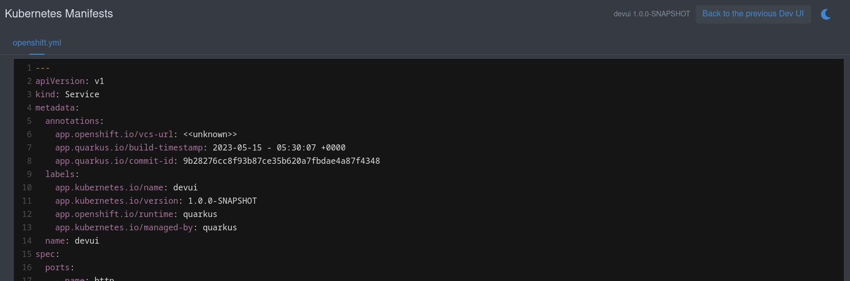
import 'qui-code-block';<div class="codeBlock">
<qui-code-block
mode='yaml'
content='${yaml}'>
</qui-code-block>
</div>;or fetching the contents from a URL:
<div class="codeBlock">
    <qui-code-block
        mode='${this._mode}'
        src='${this._externalUrl}'>
    </qui-code-block>
</div>内部コントローラーの使用
Some internal controllers is available to make certain things easier:
-
Notifier
-
Storage
-
Log
-
Router
-
JsonRPC
Notifier
This is an easy way to show a toast message. The toast can be placed on the screen (default left bottom) and can have a level (Info, Success, Warning, Error). Any of the levels can also be primary, that will create a more prominent toast message.
このコントローラーのソースについては、 こちら を参照してください。
使用例:
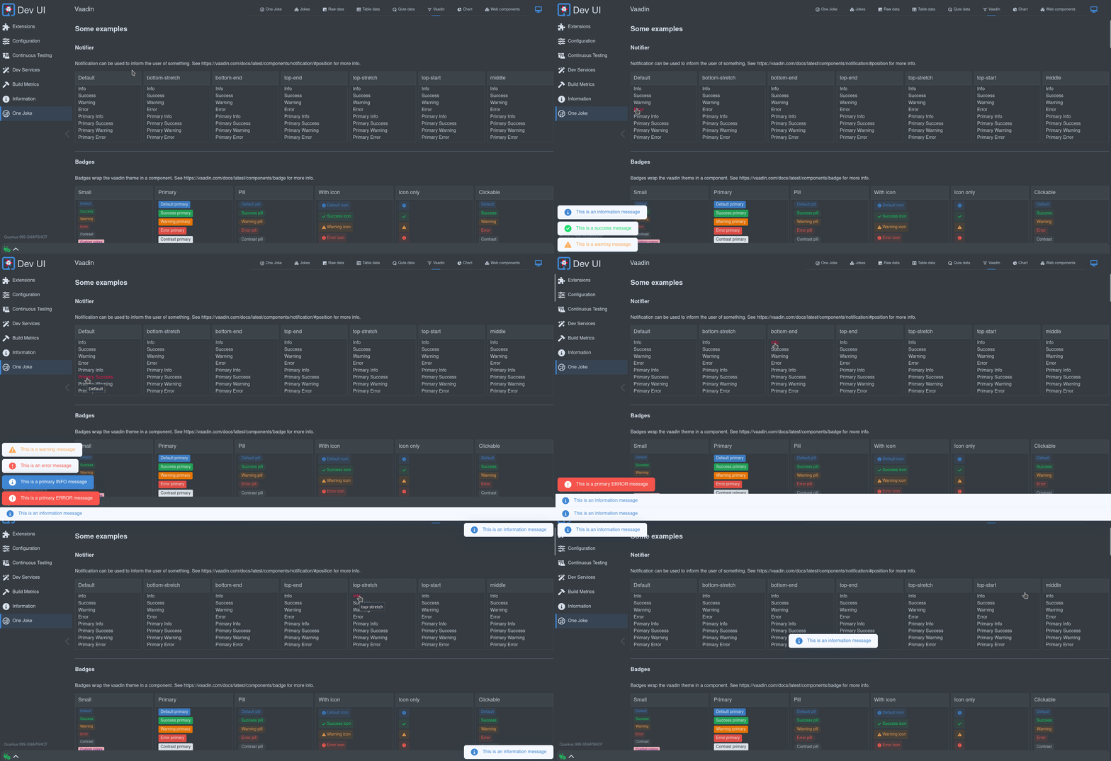
import { notifier } from 'notifier';<a @click=${() => this._info()}>Info</a>;_info(position = null){
notifier.showInfoMessage("This is an information message", position);
}有効な位置はすべて こちら で確認できます。
Storage
An easy way to access the local storage in a safe way. This will store values in the local storage, scoped to your extension. This way you do not have to worry that you might clash with another extension.
Local storage is useful to remember user preferences or state. Example, the footer remembers the state (open/close) and the size when open of the bottom drawer.
import { StorageController } from 'storage-controller';

// ...

storageControl = new StorageController(this); // Passing in this will scope the storage to your extension

// ...

const storedHeight = this.storageControl.get("height"); // Get some value

// ...

this.storageControl.set('height', 123); // Set some valLog
The log controller is used to add control buttons to a (footer) log. See Add a log file.

import { LogController } from 'log-controller';

// ...

logControl = new LogController(this); // Passing in this will scope the control to your extension

// ...
this.logControl
                .addToggle("On/off switch", true, (e) => {
                    this._toggleOnOffClicked(e);
                }).addItem("Log levels", "font-awesome-solid:layer-group", "var(--lumo-tertiary-text-color)", (e) => {
                    this._logLevels();
                }).addItem("Columns", "font-awesome-solid:table-columns", "var(--lumo-tertiary-text-color)", (e) => {
                    this._columns();
                }).addItem("Zoom out", "font-awesome-solid:magnifying-glass-minus", "var(--lumo-tertiary-text-color)", (e) => {
                    this._zoomOut();
                }).addItem("Zoom in", "font-awesome-solid:magnifying-glass-plus", "var(--lumo-tertiary-text-color)", (e) => {
                    this._zoomIn();
                }).addItem("Clear", "font-awesome-solid:trash-can", "var(--lumo-error-color)", (e) => {
                    this._clearLog();
                }).addFollow("Follow log", true , (e) => {
                    this._toggleFollowLog(e);
}).done();Router
The router is mostly used internally. This uses Vaadin Router under the covers to route urls to the correct page/section within the SPA. It will update the navigation and allow history (back button). This also creates the sub-menu available on extensions that has multiple pages.
controller には、役立ちそうなメソッドが記載されています。
JsonRPC
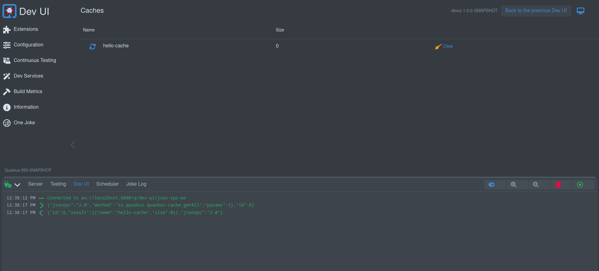
This controller allows you to fetch or stream runtime data. (vs. [Build time data] discussed earlier). There are two parts to getting data during runtime. The Java side in the runtime module, and then the usage in the web component.
Java パート
このコードは、データを UI に表示できるようにする役割を担います。
You need to register the JsonPRCService in your processor in the deployment module:
@BuildStep(onlyIf = IsDevelopment.class)(1)
JsonRPCProvidersBuildItem createJsonRPCServiceForCache() {(2)
    return new JsonRPCProvidersBuildItem(CacheJsonRPCService.class);(3)
}| 1 | 必ず開発モードでのみ実行してください。 |
| 2 | Produce / return a JsonRPCProvidersBuildItem |
| 3 | Define the class in your runtime module that will contain methods that makes data available in the UI |
Now, in your Runtime module create the JsonRPC Service. This class will default to an application scoped bean, except if you explicitly scope the bean. All public methods that return something will be made available to call from the Web component Javascript.
これらのメソッドで返されるオブジェクトは次のとおりです。
-
プリミティブまたは
String -
io.vertx.core.json.JsonArray -
io.vertx.core.json.JsonObject -
any other POJO that can be serializable to Json
All of the above can be blocking (POJO) or non-blocking (@NonBlocking or Uni). Or alternatively data can be streamed using Multi.
@NonBlocking (1)
public JsonArray getAll() { (2)
    Collection<String> names = manager.getCacheNames();
    List<CaffeineCache> allCaches = new ArrayList<>(names.size());
    for (String name : names) {
        Optional<Cache> cache = manager.getCache(name);
        if (cache.isPresent() && cache.get() instanceof CaffeineCache) {
            allCaches.add((CaffeineCache) cache.get());
        }
    }
    allCaches.sort(Comparator.comparing(CaffeineCache::getName));

    var array = new JsonArray();
    for (CaffeineCache cc : allCaches) {
        array.add(getJsonRepresentationForCache(cc));
    }
    return array;
}| 1 | This example runs non blocking. We could also return Uni<JsonArray> |
| 2 | メソッド名 getAll は Javascript で使用できます。 |
Webcomponent (Javascript) パート
Now you can use the JsonRPC controller to access the getAll method (and any other methods in you JsonRPC Service)
import { JsonRpc } from 'jsonrpc';

// ...

jsonRpc = new JsonRpc(this); // Passing in this will scope the rpc calls to your extension

// ...

/**
  * Called when displayed
  */
connectedCallback() {
    super.connectedCallback();
    this.jsonRpc.getAll().then(jsonRpcResponse => { (1)
        this._caches = new Map();
        jsonRpcResponse.result.forEach(c => { (2)
            this._caches.set(c.name, c);
        });
    });
}| 1 | getAll メソッドは、Java サービスのメソッドに対応していることに注意してください。このメソッドは、JsonRPC の結果を含む Promise を返します。 |
| 2 | in this case the result is an array, so we can loop over it. |
JsonArray (or any Java collection) in either blocking or non-blocking will return an array, else a JsonObject will be returned.
You can also pass in parameters in the method being called, example: (In the Runtime Java code)
public Uni<JsonObject> clear(String name) { (1)
    Optional<Cache> cache = manager.getCache(name);
    if (cache.isPresent()) {
        return cache.get().invalidateAll().map((t) -> getJsonRepresentationForCache(cache.get()));
    } else {
        return Uni.createFrom().item(new JsonObject().put("name", name).put("size", -1));
    }
}| 1 | the clear method takes one parameter called name |
Webcomponent (Javascript) の場合:
_clear(name) {
    this.jsonRpc.clear({name: name}).then(jsonRpcResponse => { (1)
        this._updateCache(jsonRpcResponse.result)
    });
}| 1 | the name parameter is passed in. |
ストリーミングデータ
データを継続的に画面にストリーミングすることで、UI 画面を最新のデータで更新することができます。これは、 Multi (Java 側) と Observer (Javascript 側) で実行できます。
ストリーミングデータの Java 側:
public class JokesJsonRPCService {

    private final BroadcastProcessor<Joke> jokeStream = BroadcastProcessor.create();

    @PostConstruct
    void init() {
        Multi.createFrom().ticks().every(Duration.ofHours(4)).subscribe().with((item) -> {
            jokeStream.onNext(getJoke());
        });
    }

    public Multi<Joke> streamJokes() { (1)
        return jokeStream;
    }

    // ...
}| 1 | jokes をストリーミングする Multi を返します。 |
ストリーミングデータの Javascript 側:
this._observer = this.jsonRpc.streamJokes().onNext(jsonRpcResponse => { (1)
    this._addToJokes(jsonRpcResponse.result);
    this._numberOfJokes = this._numberOfJokes++;
});

// ...

this._observer.cancel(); (2)| 1 | メソッドを呼び出し (オプションでパラメーターを渡す)、次のイベントで呼び出されるコードを提供できます。 |
| 2 | 必要に応じて後でキャンセルできるように、オブザーバーのインスタンスを保管してください。 |
ホットリロード
You can update a screen automatically when a Hot reload has happened. To do this replace the LitElement that your Webcomponent extends with QwcHotReloadElement.
QwcHotReloadElement extends LitElement so your component is still a Lit Element.
When extending a QwcHotReloadElement you have to provide the hotReload method. (You also still need to provide the render method from Lit)
import { QwcHotReloadElement, html, css} from 'qwc-hot-reload-element';

// ...

export class QwcMyExtensionPage extends QwcHotReloadElement {

    render(){
        // ...
    }

    hotReload(){
        // ..
    }

}
カスタムカード
You can customise the card that is being displayed on the extension page if you do not want to use the default built-in card.
To do this, you need to provide a Webcomponent that will be loaded in the place of the provided card and register this in the Java Processor:
cardPageBuildItem.setCustomCard("qwc-mycustom-card.js");Javascript 側では、すべてのページにアクセスできます (リンクを作成する必要がある場合)。
import { pages } from 'build-time-data';And the following properties will be passes in:
-
extensionName
-
description
-
guide
-
namespace
static properties = {
    extensionName: {type: String},
    description: {type: String},
    guide: {type: String},
    namespace: {type: String}
}
State (Advance)
State allows properties to contain state and can be reused globally. An example of state properties are the theme, the connection state (if we are connected to the backend), etc.
現在の組み込み 状態オブジェクトを参照してください。
The state in Dev UI uses LitState and you can read more about it in their documentation.
Add a log file
Apart from adding a card and a page, extensions can add a log to the footer. This is useful to log things happening continuously. A page will lose connection to the backend when navigating away from that page, a log in the footer is permanently connected.
フッターに何かを追加する方法はカードを追加する方法と同じですが、 CardPageBuildItem ではなく FooterPageBuildItem を使用する点のみ異なります。
FooterPageBuildItem footerPageBuildItem = new FooterPageBuildItem();

footerPageBuildItem.addPage(Page.webComponentPageBuilder()
        .icon("font-awesome-regular:face-grin-tongue-wink")
        .title("Joke Log")
        .componentLink("qwc-jokes-log.js"));

footerProducer.produce(footerPageBuildItem);In your Webcomponent you can then stream the log to the UI:
export class QwcJokesLog extends LitElement {
    jsonRpc = new JsonRpc(this);
    logControl = new LogController(this);

    // ....
}セクションメニューの追加
これにより、エクステンションはセクションメニュー内のページに直接リンクできるようになります。
セクションメニューに何かを追加する方法はカードを追加する方法と同じですが、 CardPageBuildItem ではなく MenuPageBuildItem を使用する点のみ異なります。
MenuPageBuildItem menuPageBuildItem = new MenuPageBuildItem();

menuPageBuildItem.addPage(Page.webComponentPageBuilder()
        .icon("font-awesome-regular:face-grin-tongue-wink")
        .title("One Joke")
        .componentLink("qwc-jokes-menu.js"));

menuProducer.produce(menuPageBuildItem);ページはカードに似た任意のページにできます。
テスト
エクステンションには、以下をテストするテストを追加できます。
-
ビルド時データ
-
JsonRPC経由の実行時データ
You need to add this to your pom:
<dependency>
    <groupId>io.quarkus</groupId>
    <artifactId>quarkus-vertx-http-dev-ui-tests</artifactId>
    <scope>test</scope>
</dependency>
そうすることで、テストを作成するための 2 つのベースクラスにアクセスできるようになります。
ビルド時データのテスト
ビルド時データを追加した場合の例:
cardPageBuildItem.addBuildTimeData("somekey", somevalue);To test that your build time data is generated correctly you can add a test that extends DevUIBuildTimeDataTest.
public class SomeTest extends DevUIBuildTimeDataTest {

    @RegisterExtension
    static final QuarkusDevModeTest config = new QuarkusDevModeTest().withEmptyApplication();

    public SomeTest() {
        super("io.quarkus.my-extension");
    }

    @Test
    public void testSomekey() throws Exception {
        JsonNode somekeyResponse = super.getBuildTimeData("somekey");
        Assertions.assertNotNull(somekeyResponse);

        // Check more values on somekeyResponse
    }

}
実行時データのテスト
実行時データレスポンスが含まれる JsonRPC サービスを追加した場合の例:
public boolean updateProperties(String content, String type) {
    // ...
}
To test that updateProperties execute correctly via JsonRPC you can add a test that extends DevUIJsonRPCTest.
public class SomeTest extends DevUIJsonRPCTest {

    @RegisterExtension
    static final QuarkusDevModeTest config = new QuarkusDevModeTest().withEmptyApplication();

    public SomeTest() {
        super("io.quarkus.my-extension");
    }

    @Test
    public void testUpdateProperties() throws Exception {

        JsonNode updatePropertyResponse = super.executeJsonRPCMethod("updateProperty",
                Map.of(
                        "name", "quarkus.application.name",
                        "value", "changedByTest"));
        Assertions.assertTrue(updatePropertyResponse.asBoolean());

        // Get the properties to make sure it is changed
        JsonNode allPropertiesResponse = super.executeJsonRPCMethod("getAllValues");
        String applicationName = allPropertiesResponse.get("quarkus.application.name").asText();
        Assertions.assertEquals("changedByTest", applicationName);
    }
}
